DESKTOP APP
Leveraging an API to Optimize Time Tracking
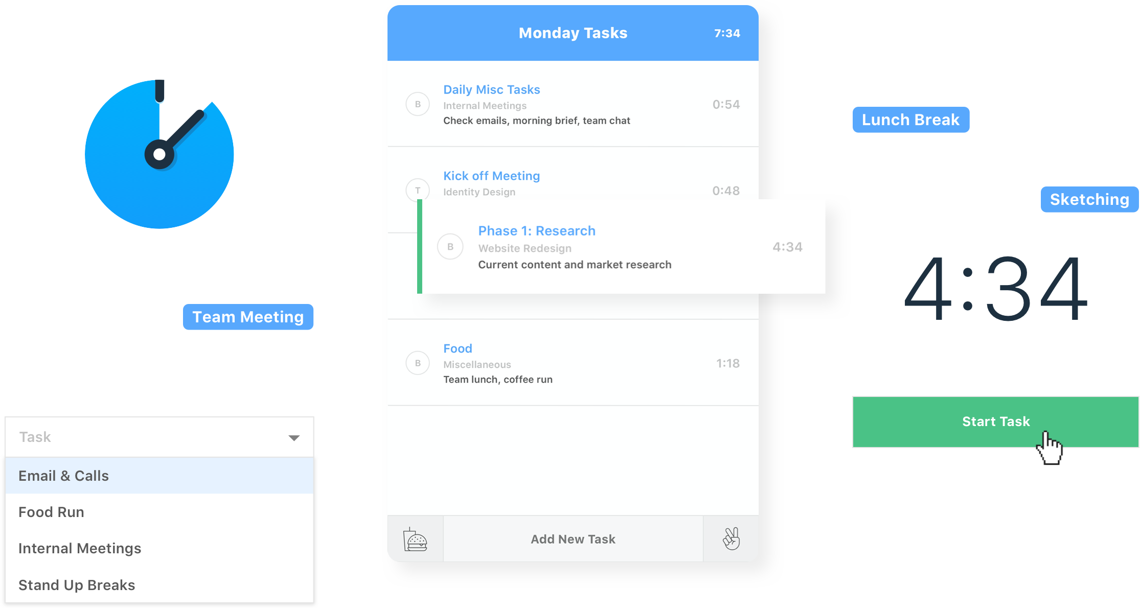
When the time tracking app that we used internally to log hours upgraded to a completely new version, we lost a lot of crucial features that we previously relied on for effective time tracking. As someone who is always looking to improve our tools or processes to facilitate workflows, this was a challenge right up my alley. With input from the team, I designed, developed, and launched, a cross-platform timer app that brought back the essential features we needed and added new ones as well.
Role
User Interviews, Market Research, Visual Design, App Development
Client
Battle Medialab
Team
Project Managers
Graphic/Motion Designers
Developers
/ The problem
New app, who dis?
New app, who dis?
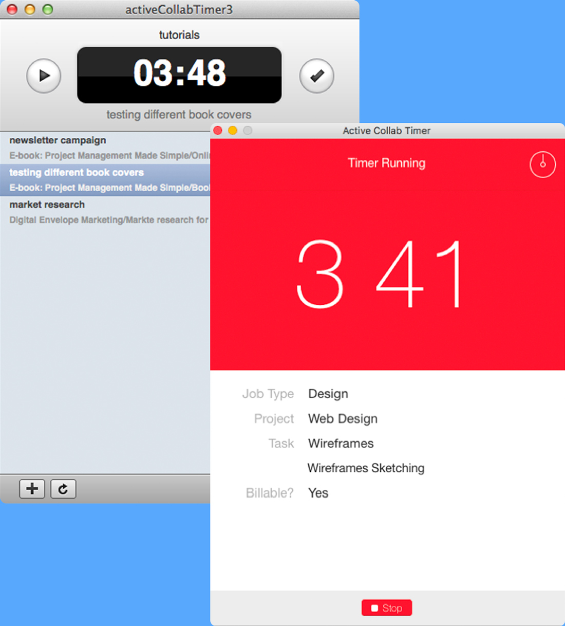
Your users! The upgrade to the time tracking app brought some great new features but we lost several ones that we used on a daily basis.
We found ourselves having to track hours on paper or guesstimating the number of hours worked for each project. This went on for two weeks while the project managers tried to see if we could downgrade to the previous version. Turns out that downgrading was not an option. At that point, I decided to get involved and explore potential solutions to our problem.
/ discovery
/ Discovery
Team interviews
I began by interviewing all of my co-workers to find out how they used the timer and the impact of the new timer on their workflow. To my surprise, everyone used the app differently with similarities within each internal team.

Project Managers
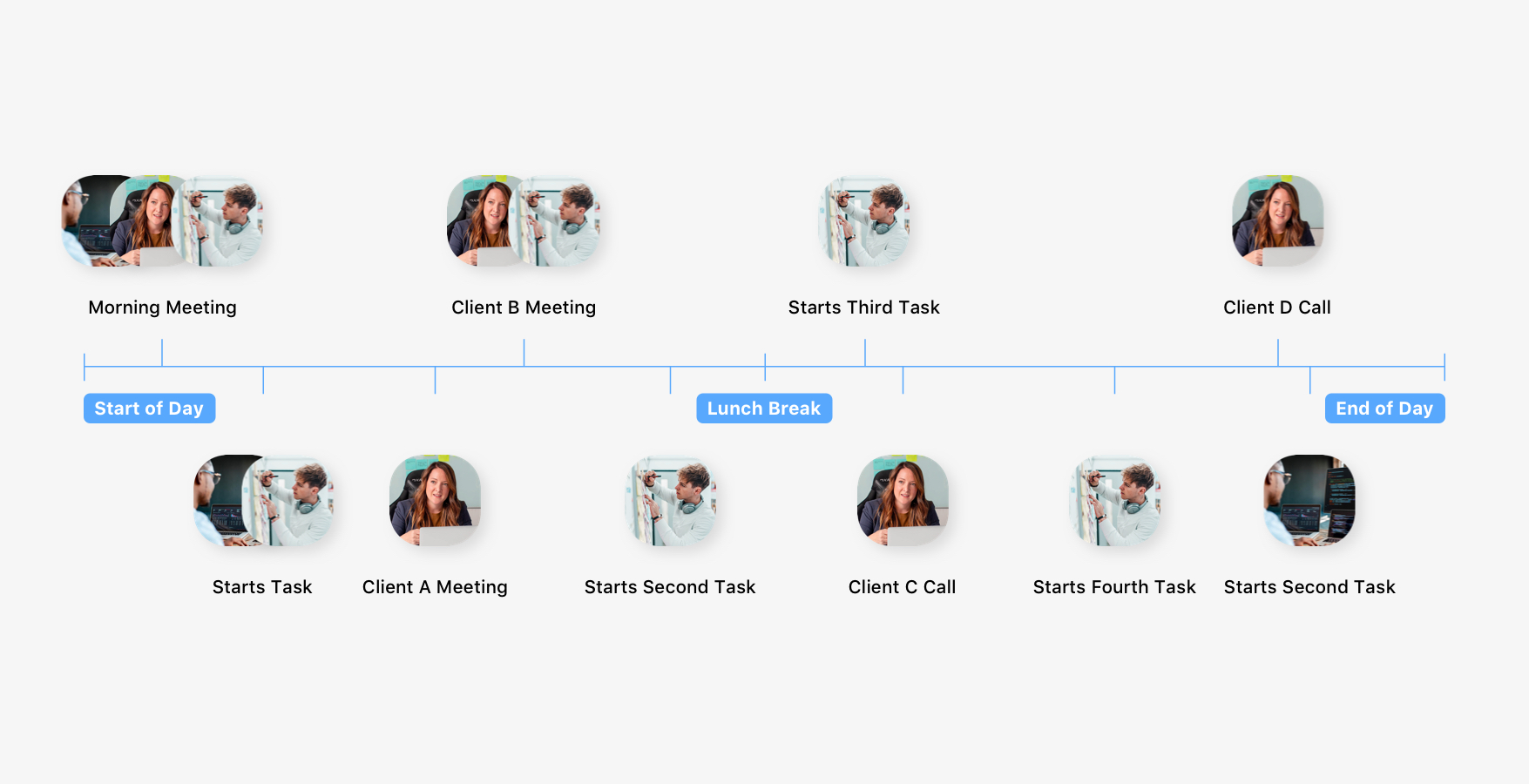
The project managers had to jump between clients and projects multiple times throughout the day.
Project Managers
The project managers had to jump between clients and projects multiple times throughout the day.
Developers
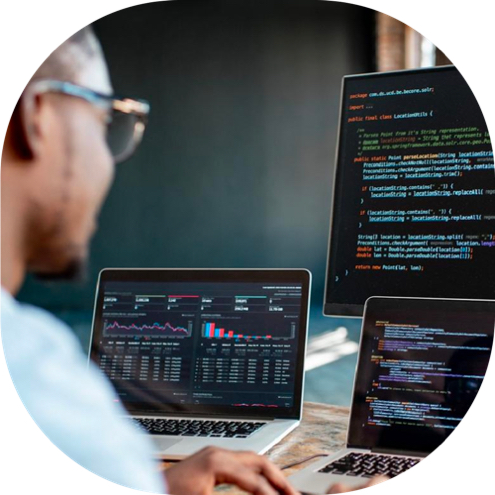
The developers worked primarily on a single project and seldomly found themselves switching between projects on a given day.

Designers
Similar to the project managers, the designers had to frequently jump between projects, small tasks, and client meetings
/ input
Talking features
With a better understanding of everyone's workflow and daily activities, I dove into getting input on specific features that they felt were beneficial from the old and new version of the app. I also held a quick ideation session to explore additional features.
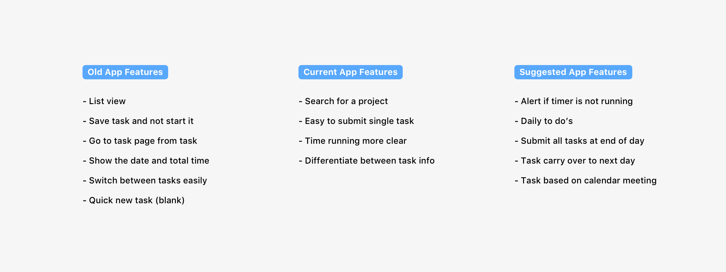
/ Market Research
/ market research
What are the alternatives?
Downgrading was not an option, so what were the options? I spent some time researching alternatives such as new project management software, tracking apps, and in-browser timers. I met again with the team and discussed my findings. Unfortunately, all of the alternatives required a decent amount of time on our part to either transition over to a new system or to learn an entirely different app. There was one more option with the potential to satisfy everyone's needs while providing a solution that was already familiar to all of us.
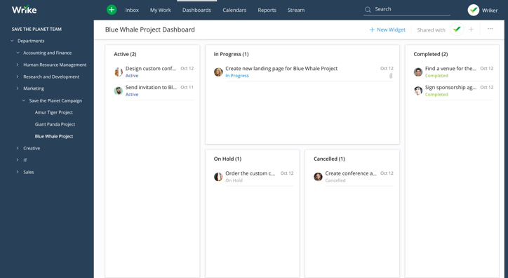
Project Management Tool
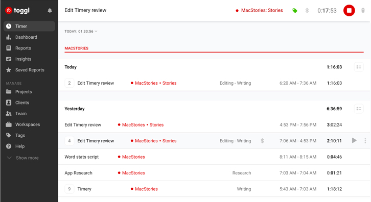
Time Tracker
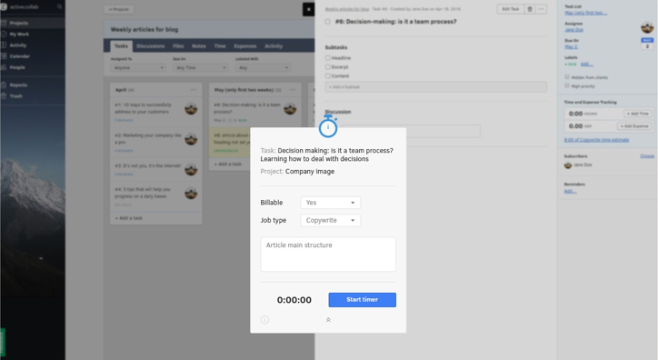
in-browser timer
/ a formidable solution
Using the API to fuse the old and the new
Choosing what information is needed and when it's needed
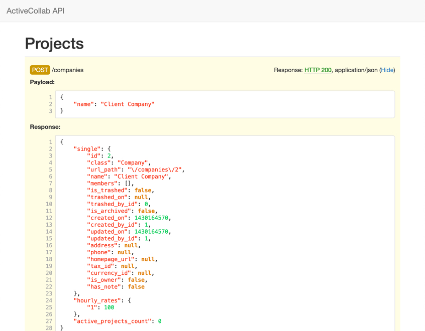
I came across the software's comprehensive API and noticed that it provided all of the functions necessary to create an app that catered to all of our needs. Although I didn't have experience developing a desktop app I figured it would be worth looking into it if this approach could help us to achieve our goals.
/ Goals
/ Goals
Taking the time out of the time-tracking process
Familiar solution
With the amount of workload we had, I needed to find a solution that would not require any downtime to set up or to learn.
Time conscious
The team was spending a decent amount of time tracking the hours on their projects so time was of the essence. I set out to complete everything within a two-week timeline outside of work since there was no free time during the workday.
/ research
/ research
Defining the app's framework

Given the timeframe, I looked into different ways that would allow me to launch an app cross-browser and develop it using either vanilla js or any other javascript framework/library. Enter Electron JS and their motto "If you can build a website, you can build a desktop app." Well...that sounds good to me! In addition to not having to learn a new language, Electron JS provides extensive documentation that makes it easy for a newcomer to pick up relatively quickly.
/ ideating
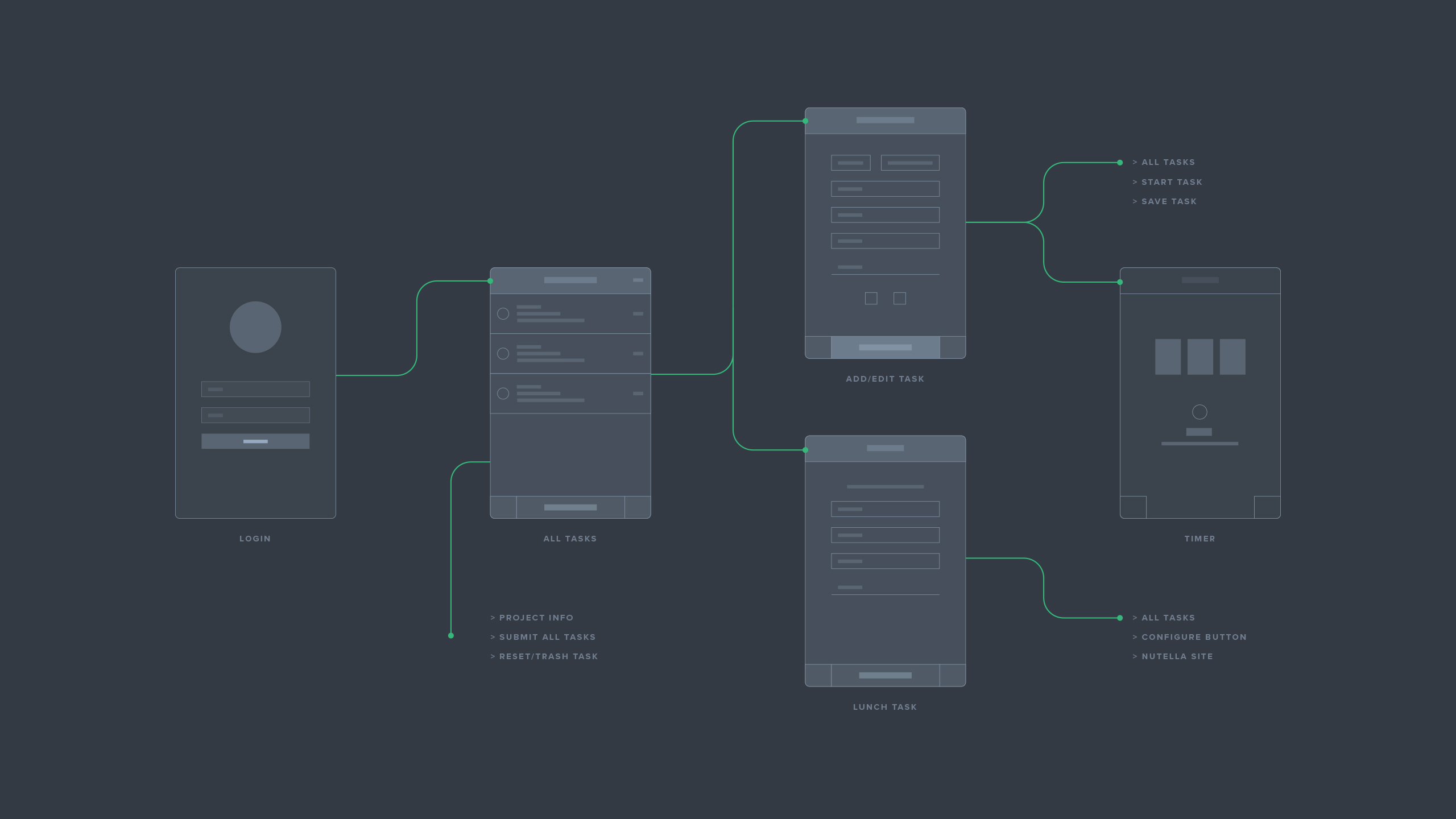
Sketching the features & defining the user flow
Choosing what information is needed and when it's needed
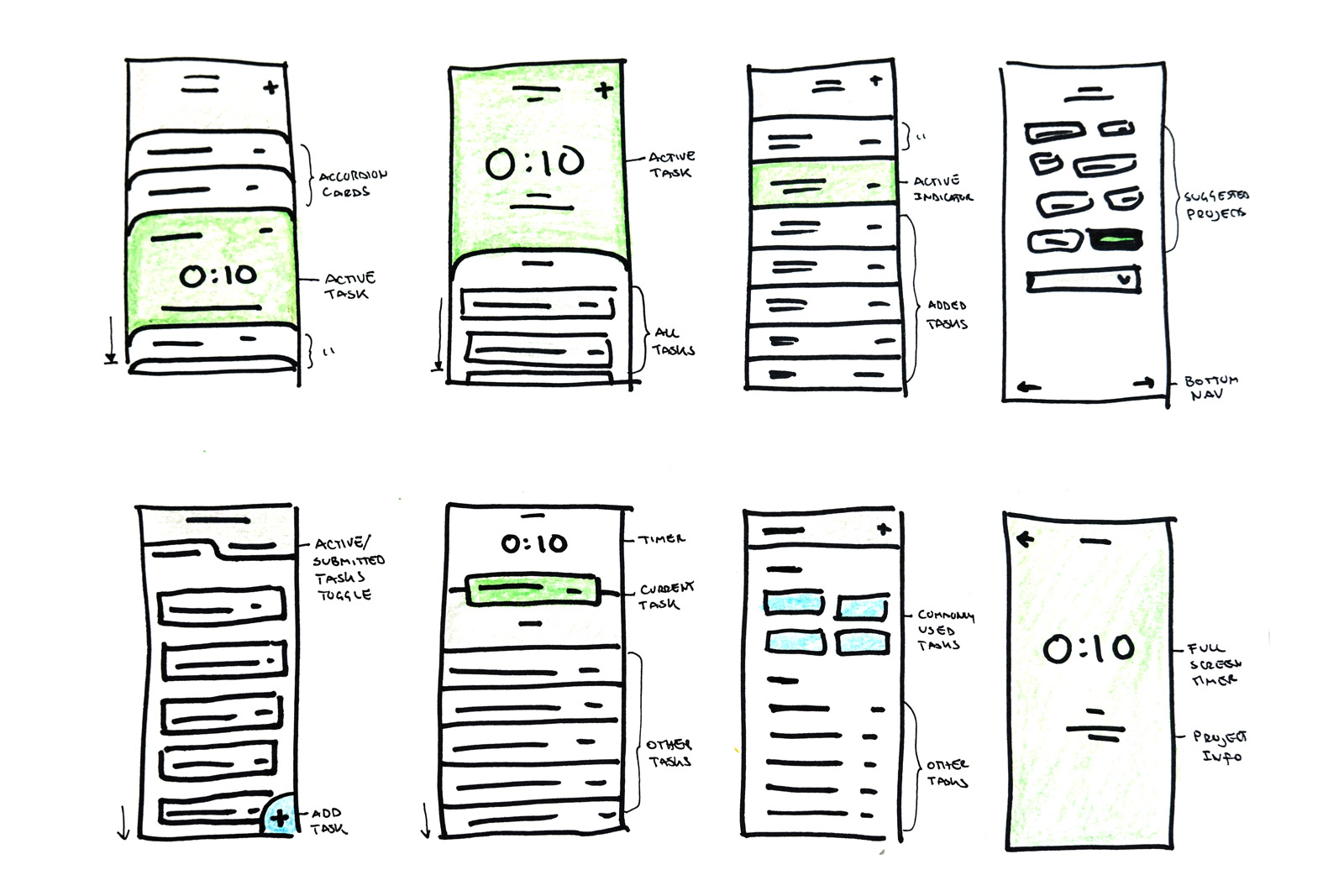
I sketched a series of concepts that integrated all of the features we had defined as a team. I had to be very conscious of what components to include because any complexity would result in more development time. In order to keep the experience familiar for the team, I opted for a hybrid of the old and new version of the timer.
/ User Interface
A new look with a familiar face
The project list was brought back to suit the needs of project managers and designers by enabling them to switch between tasks throughout the day. The use of color and grey values within each project row is used to highlight the task name as a way to easily recognize and differentiate between projects.
One of the issues reported with the original time tracker was that it wasn't clear when a task was running. I expanded on the updated timer's approach to making the timer take up more space by going full screen and using color to differentiate between a task that is running or paused. This color is then carried to the task list as an indicator of the current status.
The navigation stays fixed to the bottom of the window establishing a consistent experience throughout the app. The major call to action of each screen is always in the middle and takes the majority of the real estate in an effort to speed up the user flow.
/ dev & deploy
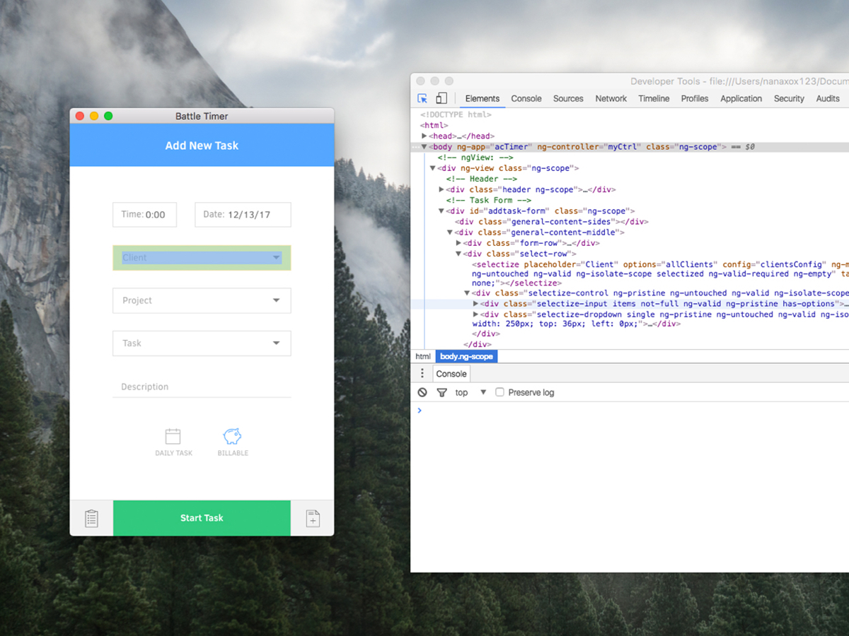
Typing away
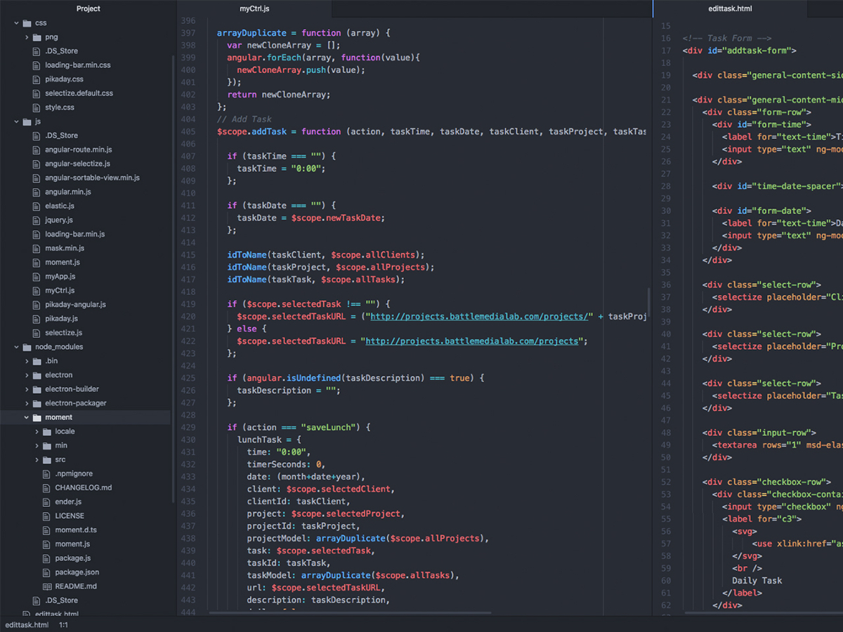
Keeping the design simple and straightforward was crucial for streamlining the development process. I developed the app using Angular JS along with a couple of Javascript libraries. I deployed the app and tested it during the workday for a whole week noting any bugs that came up so that I could fix them once I got home.
/ retrospective
Time well spent saving us all time poorly spent
Goal accomplished
I was able to install the app on everyone's computer without a problem and after a week of use, co-workers reported spending about half the time tracking their hours compared to the previous time tracker. The use of the app naturally sparked new ideas that could be included in a future update.
Improving the user experience
There were some features that I really wanted to integrate but because of time, I didn't get a chance to. Nevertheless, if I could go back I would spend more time on the "New Task" screen to make that interaction faster. An idea I had was to incorporate some sort of smart task suggestion where it would show you your frequently used tasks as well as tasks assigned to you within a certain timeframe.
MOBILE APP
Improving Millennial's Sleep Quality
© 2020 JUAN F OCAMPO