MOBILE APP
Improving Millennial's Sleep Quality
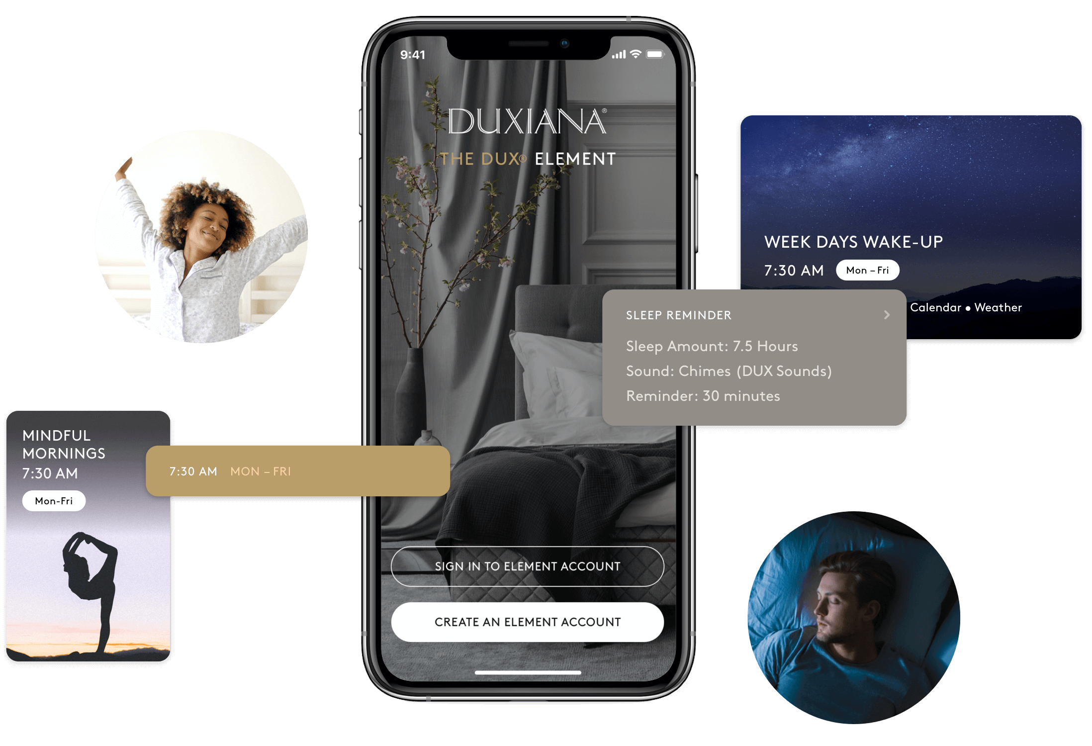
As one of the leading luxury mattress companies, Duxiana wanted to reach a new market of high earning millennials by merging the comfort of their beds with smart devices in order to provide the optimal sleep experience. As the sole product designer on the project, I was in charge of every phase of the project and collaborated along the way with the industrial designers creating the physical product as well as the software engineers developing the digital product.
Role
Discovery, Information Architecture, User Flows, Prototyping, Visual & Interaction Design
Client
Duxiana North America
Team
Industrial Designers
Software Engineers
Amazon Alexa Engineer
/ The problem
"We're putting a speaker with Alexa built-in inside our mattresses"
"We're putting a speaker with Alexa built-in inside our mattresses"
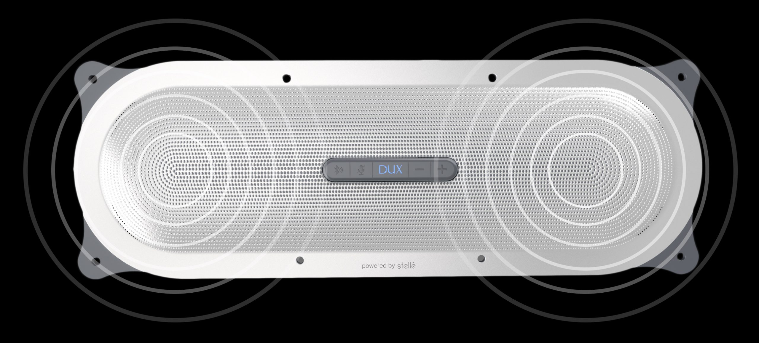
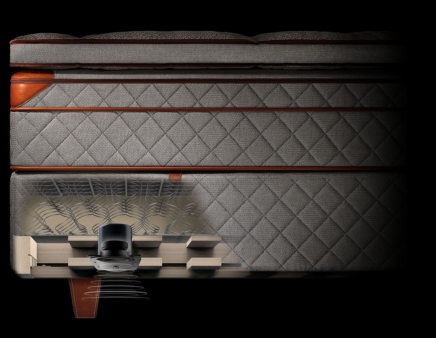
Although that was Duxiana's solution to a business problem (reaching a younger audience), it was also our initial problem. How do we create value for our target audience with this product and technology while meeting business goals?
With my own doubts and assumptions, I hit the streets and the interwebs to understand millennial's sleep tendencies and frustrations to find what sleep problems, if any, they may be experiencing. Turns out, millennial's are reporting a lack of quality sleep.
/ challenges
Minimizing App Usage
Knowing that looking at a screen before you go to sleep has a lot of adverse effects on your health, it was challenging designing a user experience that minimized, not maximized, the amount of time a user spent on the app all the while solving user needs.
There's no "me" in Millennial
As a millennial (still not sure if this is a good or bad thing), I was more or less part of our target audience which challenged me to be super-duper extra conscious of not making any assertions based on my experiences on behalf of our target audience.
Amazon's Unreleased Tech
Amazon was giving us priority to use new technology for third party apps but they didn't provide any specifics on when it would be made available to us. This made our approach to specific functionalities and timeline challenging due to the uncertainty.
/ research
/ research
Sleep research putting me to sleep...better
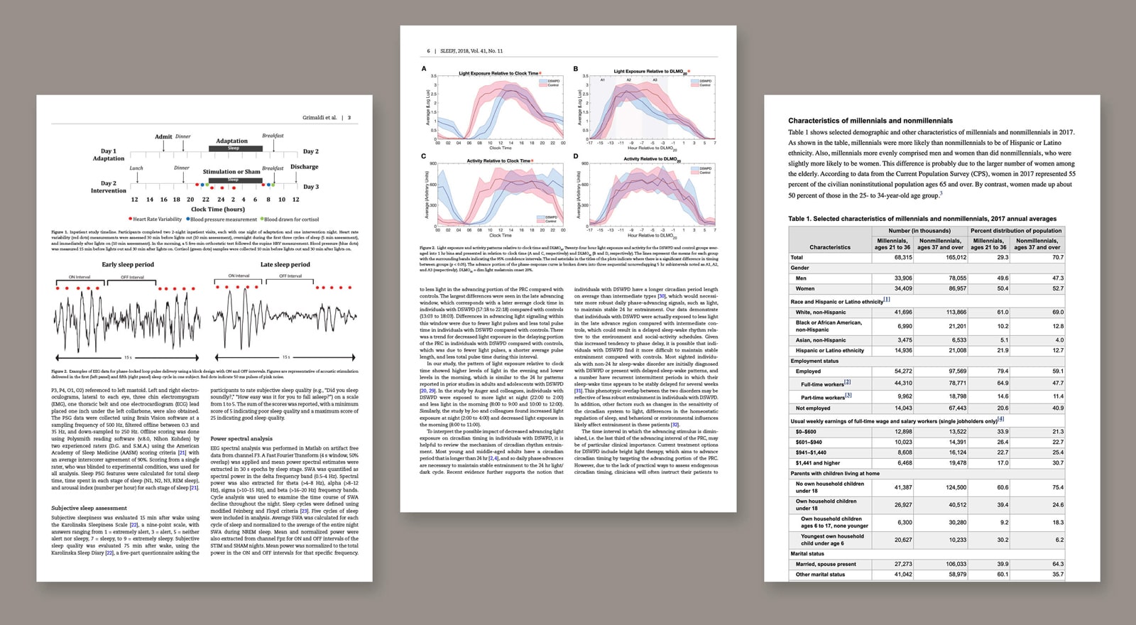
From the get-go, I educated and immersed myself on the science of sleep and its impact on our health through any material I could get my hands on, from research studies to informational videos of sleep scientists. I found multiple factors that greatly improve or decrease the quality of sleep that you get each night, with those in mind I moved on to user surveys and interviews in order to see how these factors could be affecting our target audience.
/ surveys & Interviews
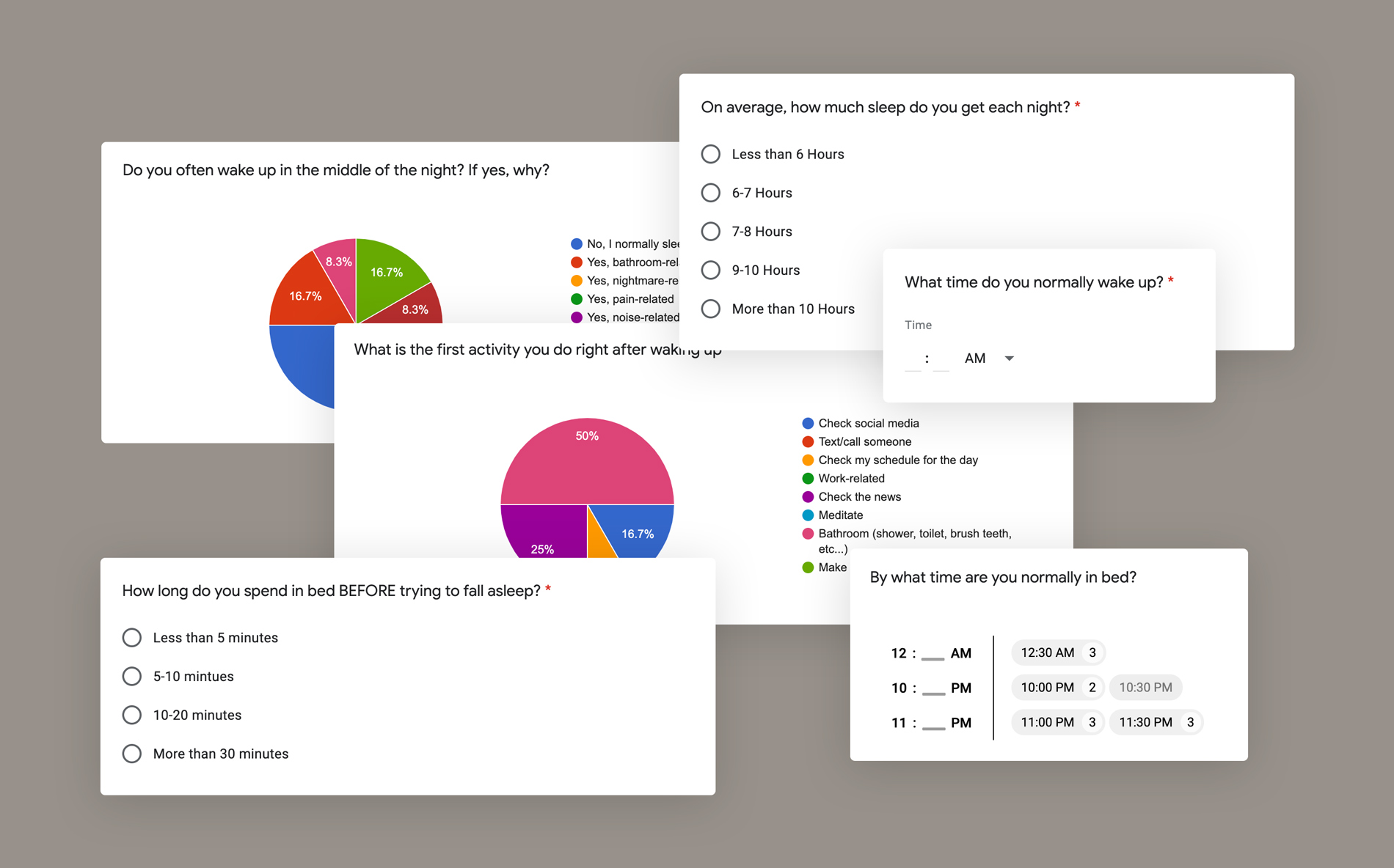
Talking to Millennials about their sleeping habits
"I sleep more than 8 hours but I still feel tired"
The findings from the survey showed that millennials are getting the recommended amount of sleep, in fact, they get more shut-eye than any other generation. However, the interviews revealed that the majority of them still feel tired and lethargic in the morning.
All 'bout that tech
An overwhelming amount of the people we surveyed reported being on their phone right before bed and right after waking up. Now, if I learned anything from sleep research is that this is no bueno for your quality of sleep.
Habitual Snoozers
Millennials love hitting the snooze on their alarm. On average they snooze more than three times. To quote sleep scientist Matthew Walker: "[when you snooze] you are literally alarming your heart."
/ market research
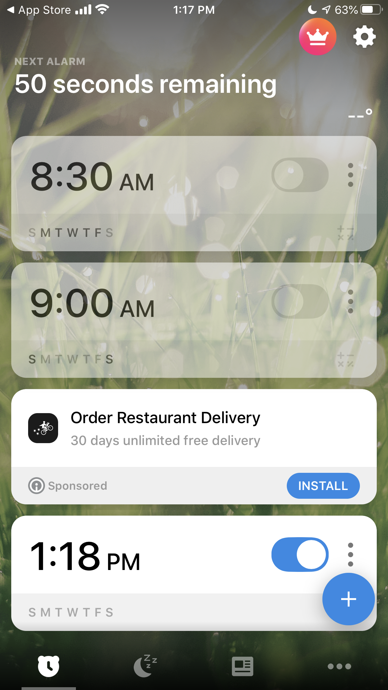
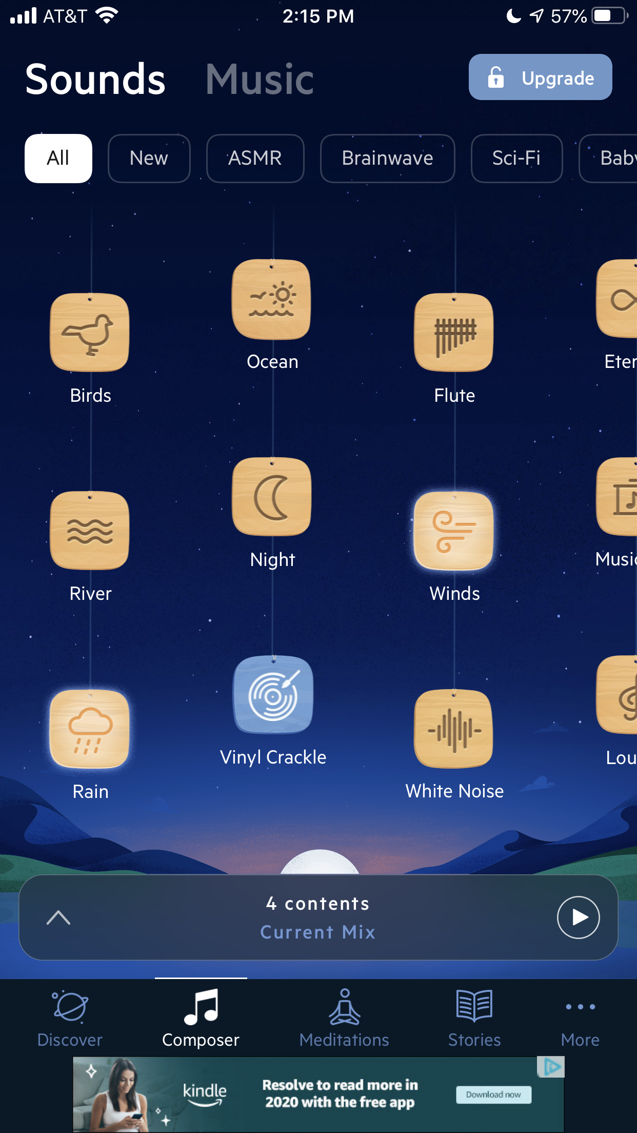
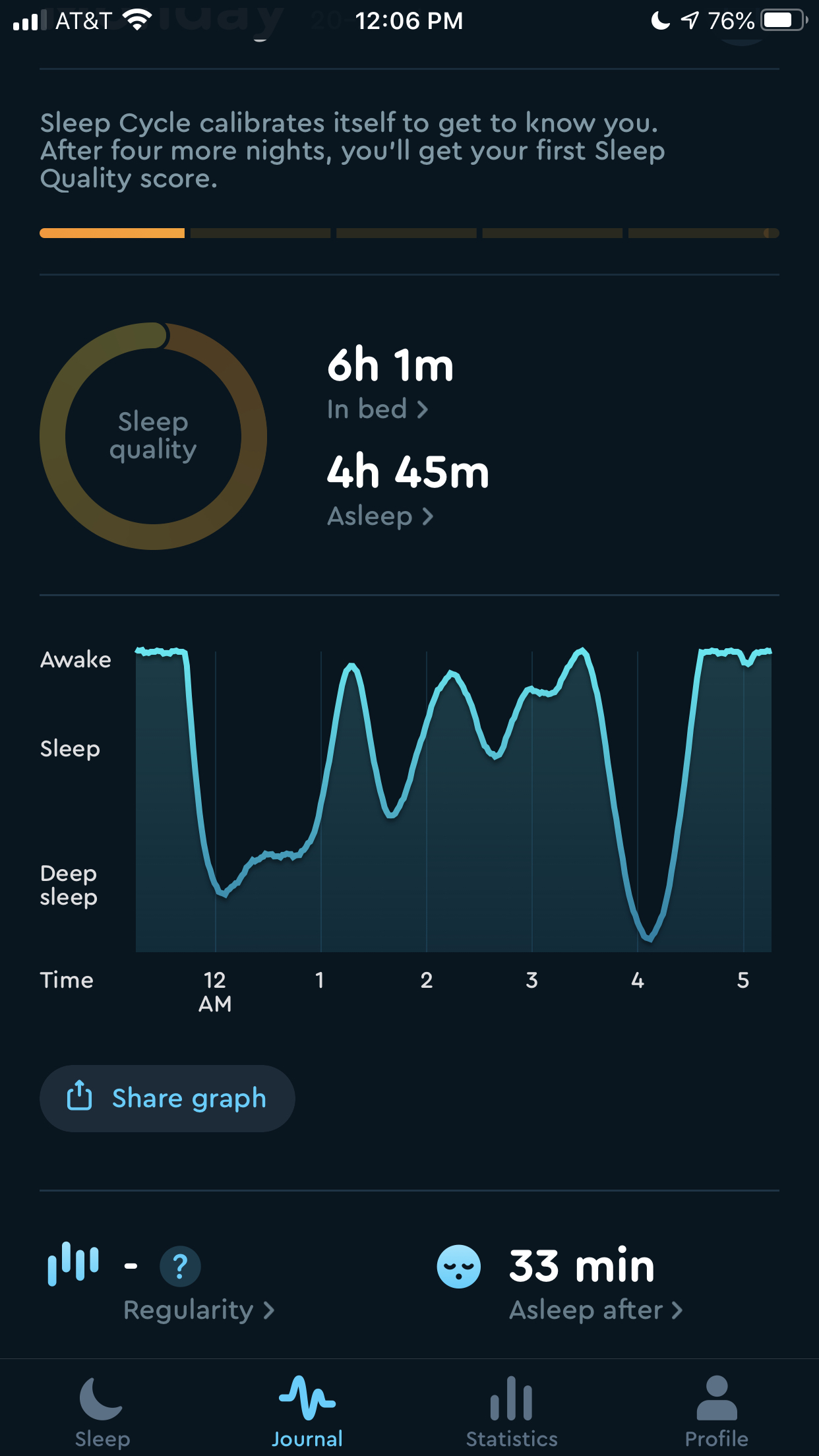
Taking a closer look at sleep apps
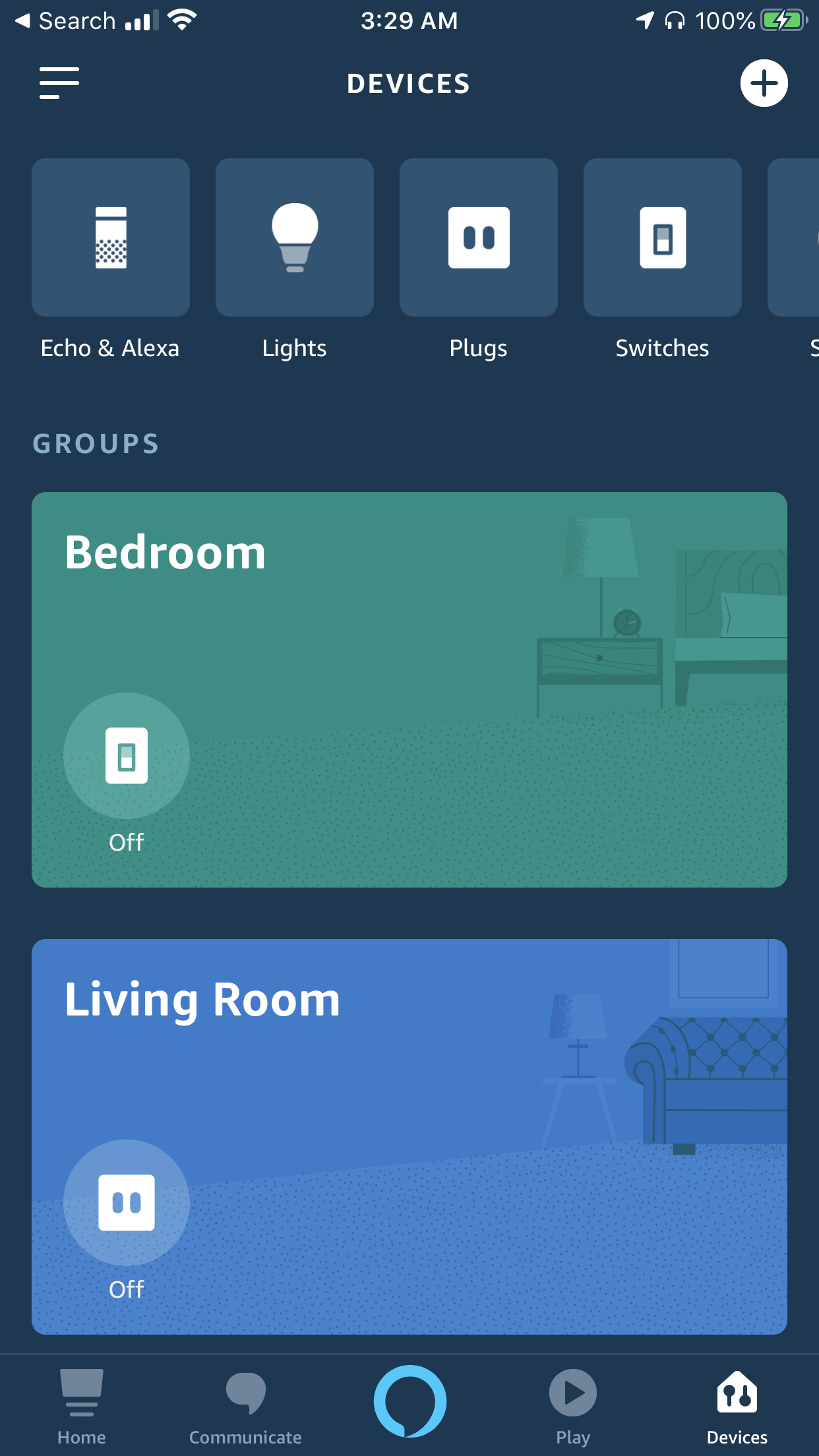
There are numerous sleep apps out there but you can group them into three categories: alarms, sleep trackers, and sleep music/sounds. The majority of these apps do little to no education on positive sleep habits and act more as a band-aid than a solution to better sleep quality. Certain apps, such as sleep trackers can inversely cause anxiety and insomnia due to an unhealthy obsession with the data being tracked, this is actually a new medical condition called Orthosomnia.
/ Goals
/ Goals
The time before you hit the sack and the time after you wake up greatly determines your sleep quality. Our goal was to increase sleep quality through wind-down
and wind-up routines.
Automating Sleep Routines
One of the main goals was to leverage Alexa's functionalities and integration with IoT devices to encourage users to incorporate healthy sleep habits into their wind down and wind up routines.
Establishing Duxiana as a Sleep Educator
Duxiana has gone out of its way to not only sell mattresses but to actively educate on better health through deeper sleep. It was important for business goals to extend Duxiana's role as an educator into the in-app experience.
Access and Control to Speaker Module
Due to the speaker module being underneath the mattress, the user would have two ways of controlling the device, one was voice activated and the other one was through the app. That meant that the digital controls for the speaker module needed to be clear and easily accessible.
/ personas & Info Architecture
/ personas & Info Architecture
Sleeping a mile in their pillows
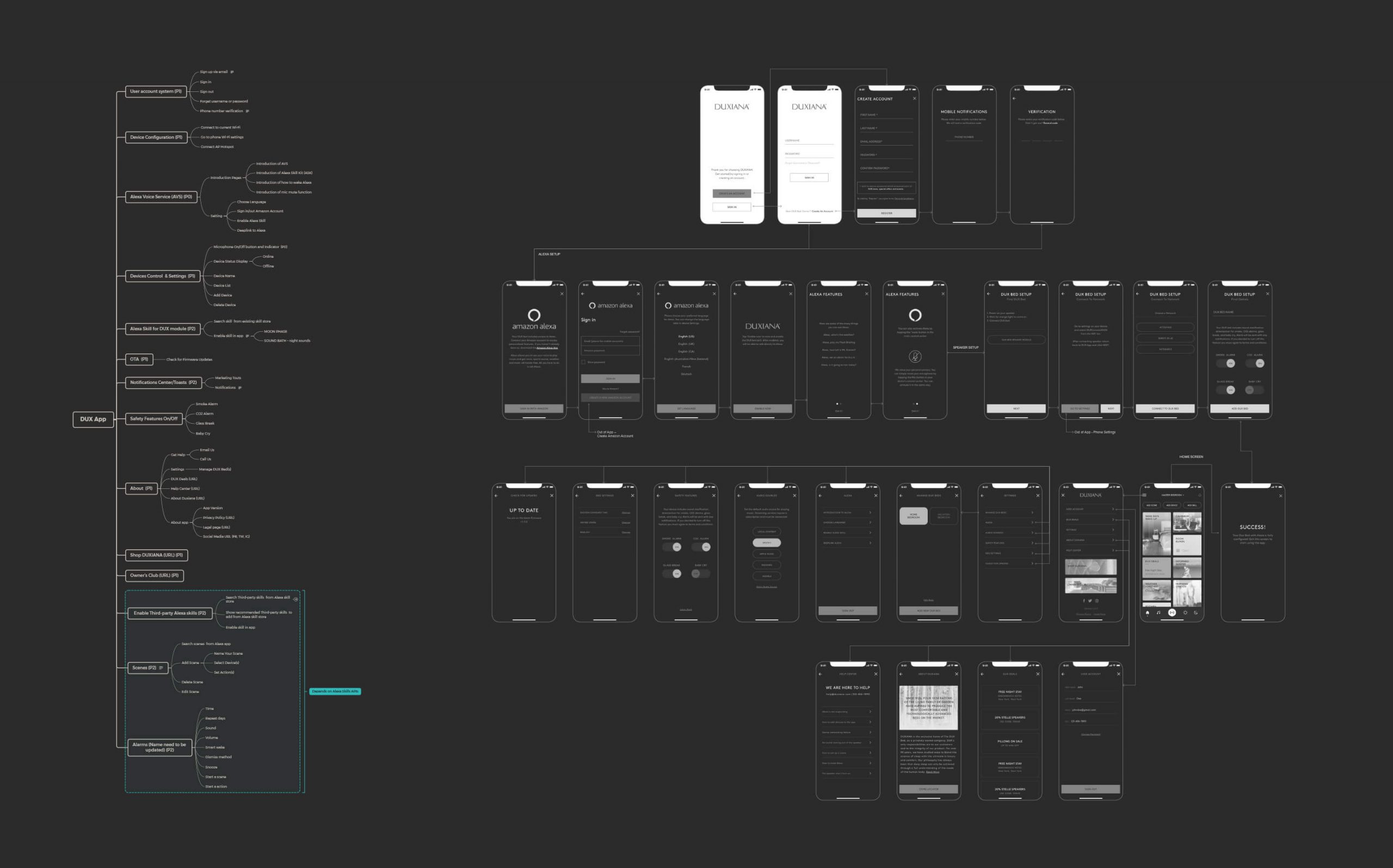
Although our target audience were millennials, not all millennials are the same (some would disagree), so in collaboration with stakeholders we came up with three personas that represented potential users. With a clear idea of who would be using this app, I created and analyzed different user flows to establish the information architecture for the app.

The Workaholic
Lauren is a 28 year old account manager who works beyond nine to five. Often working until late, she struggles getting quality sleep and falling asleep since her mind is always on work. She strives for a healthy lifestyle but struggles fitting it into her schedule.

The dad
Matt is a 33 year old work from home software engineer. He spends his free time with his partner and taking care of their baby. He normally wakes up in the middle of the night to tend to the baby but this often leads to problems falling back asleep.

The Traveler
Janine is a 37 year old regional manager who spends a quarter of her time away from home. She follows a consistent mindfulness routine when she's at home, but has a hard time keeping up with it when she's on the road working long days and staying at hotels.
/ approach
Testing user validation early on.
There were two main approaches to the user experience. One was focused primarily on the routines themselves whereas the other one was focused on user control of smart devices to provide the optimal sleep environment.
We decided to test both approaches early on and got valuable insights by testing at the Consumer Electronics Show. The main takeaway being that there is no need for another Google/Apple Home to control your devices, instead, we found validation to focus on a routine-centered experience.
/ design system
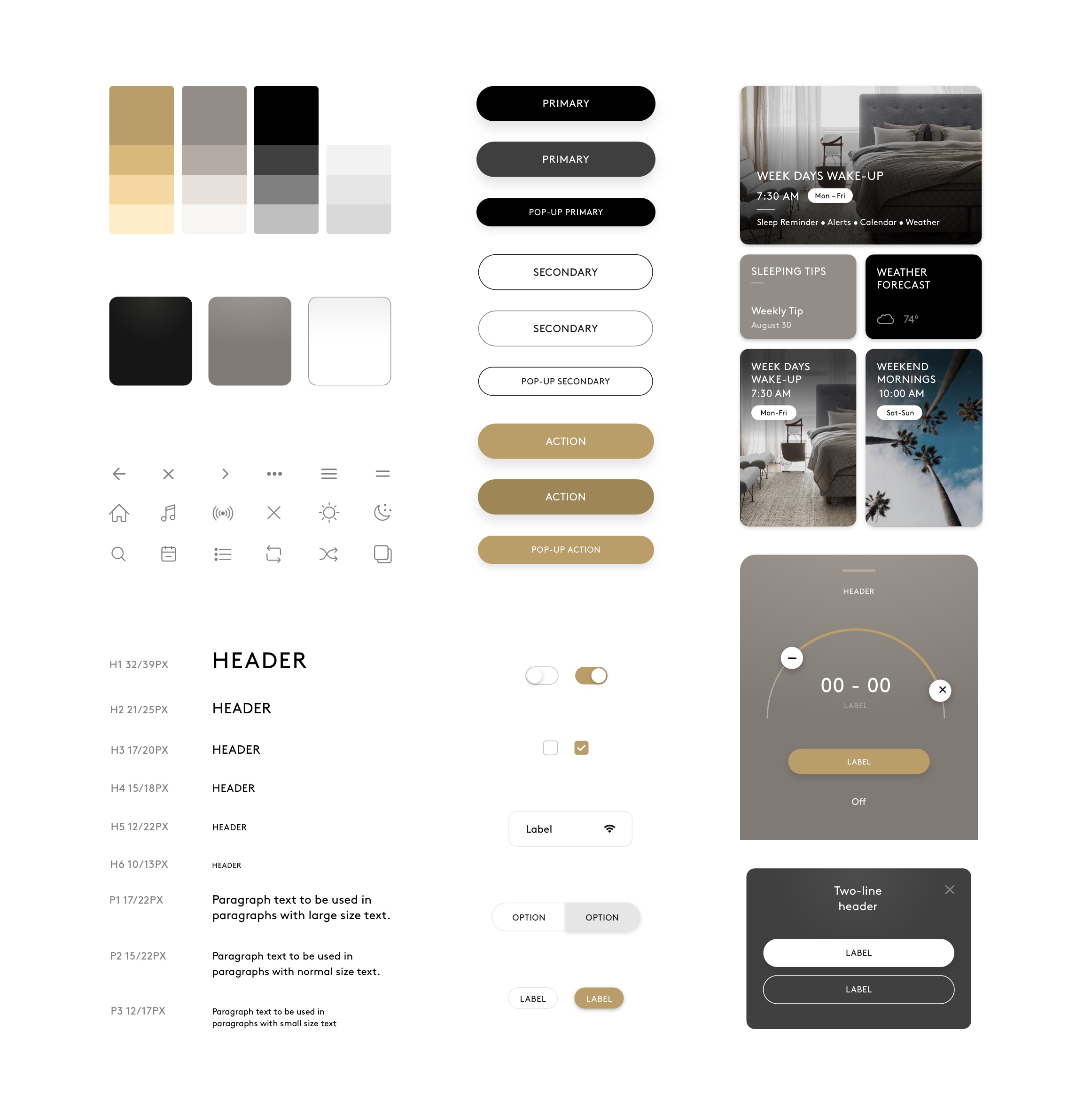
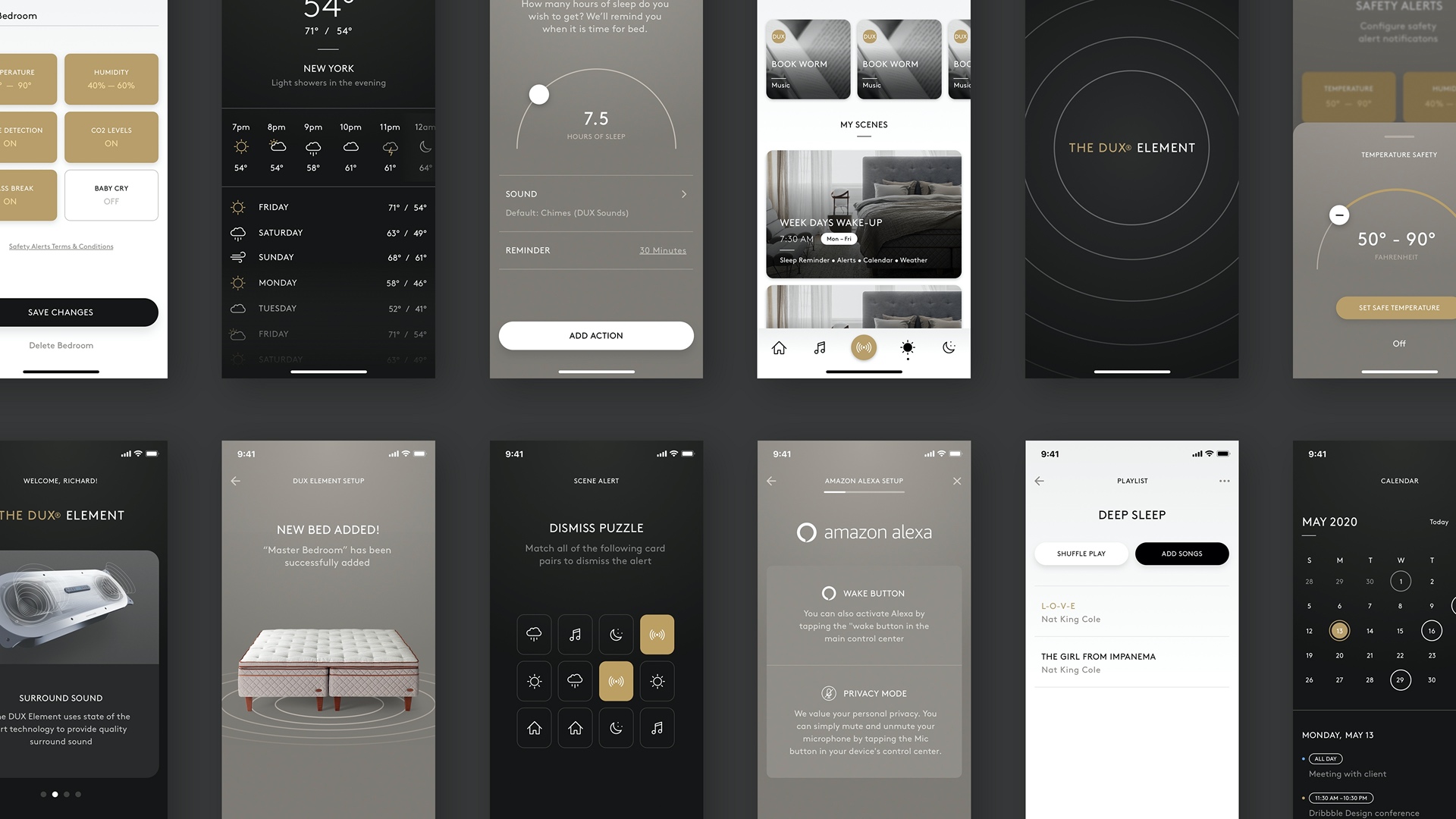
Duxiana didn't have a brand guide to work from so in order to ensure consistency I spent time getting acquainted with their visual brand language across different mediums, from their website to their store, and then I established a design system to be used throughout the app.
/ onboarding
Designing a proactive onboarding experience
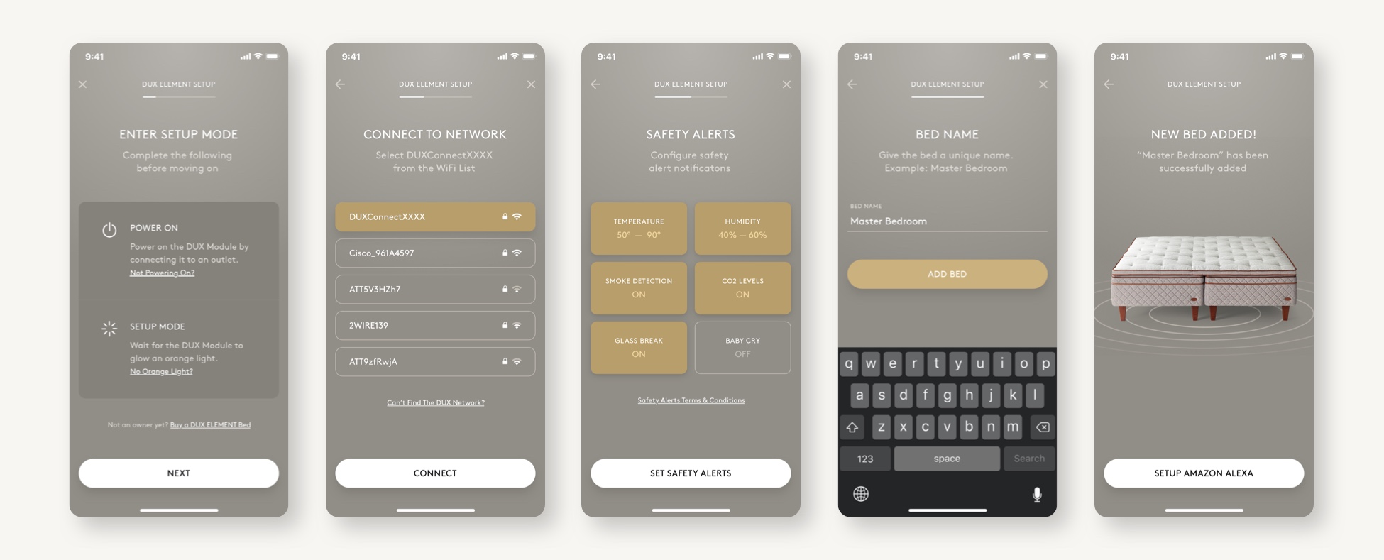
I worked closely with the engineering team to ensure intentionality on the amount of screens and their sequence that were to be part of the onboarding experience. A lot of thought went into what to feature in the initial slider that would not only inform but set expectations around privacy and sound quality.
One of the unique features of the product was the ability to detect safety factors like smoke, glass breaking, CO2 levels, and even a baby crying. Instead of just highlighting this feature I made the safety alerts an actionable screen in the setup process to encourage the user to set these alerts from the start in order to avoid potentially dangerous situations.
/ home
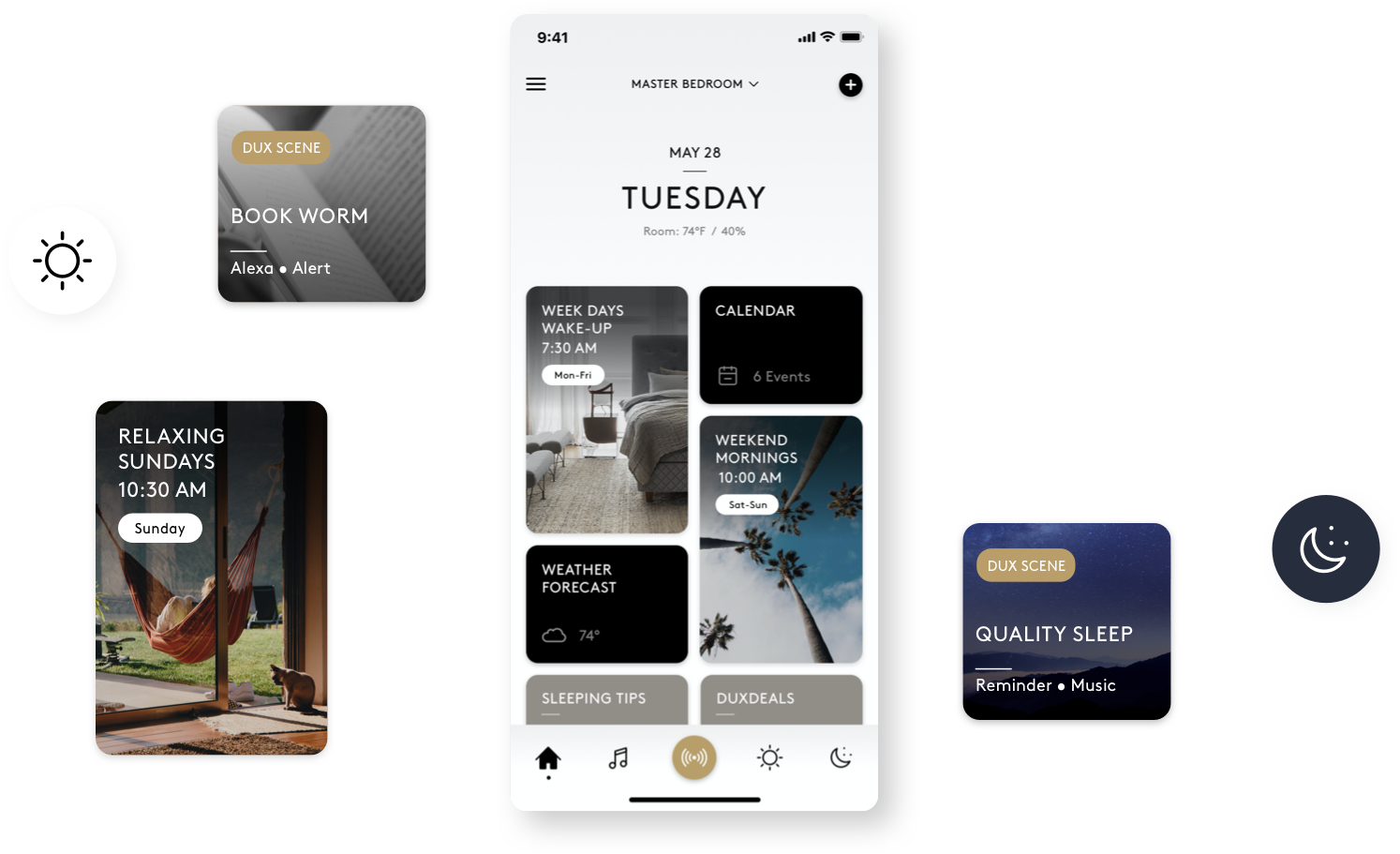
Keeping tabs and buckets
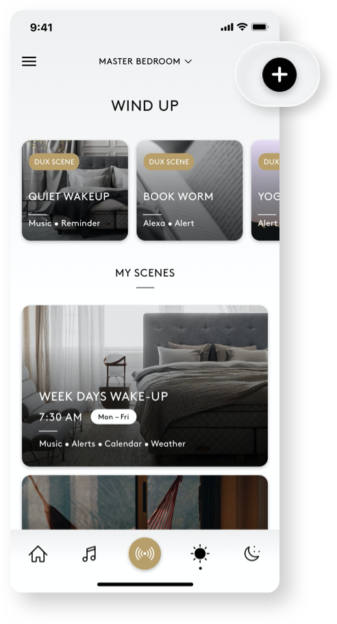
To facilitate the discoverability and reachability of favorite scenes I took a graphical approach by using buckets and differentiating between content through sizing, background color, and use of photography. The bottom tabbed navigation was used to keep top-level content withing thumb reach and also to provide a straightforward, familiar navigation.
/ progressive disclosure
Choosing what information is needed and when it's needed
Choosing what information is needed and when it's needed
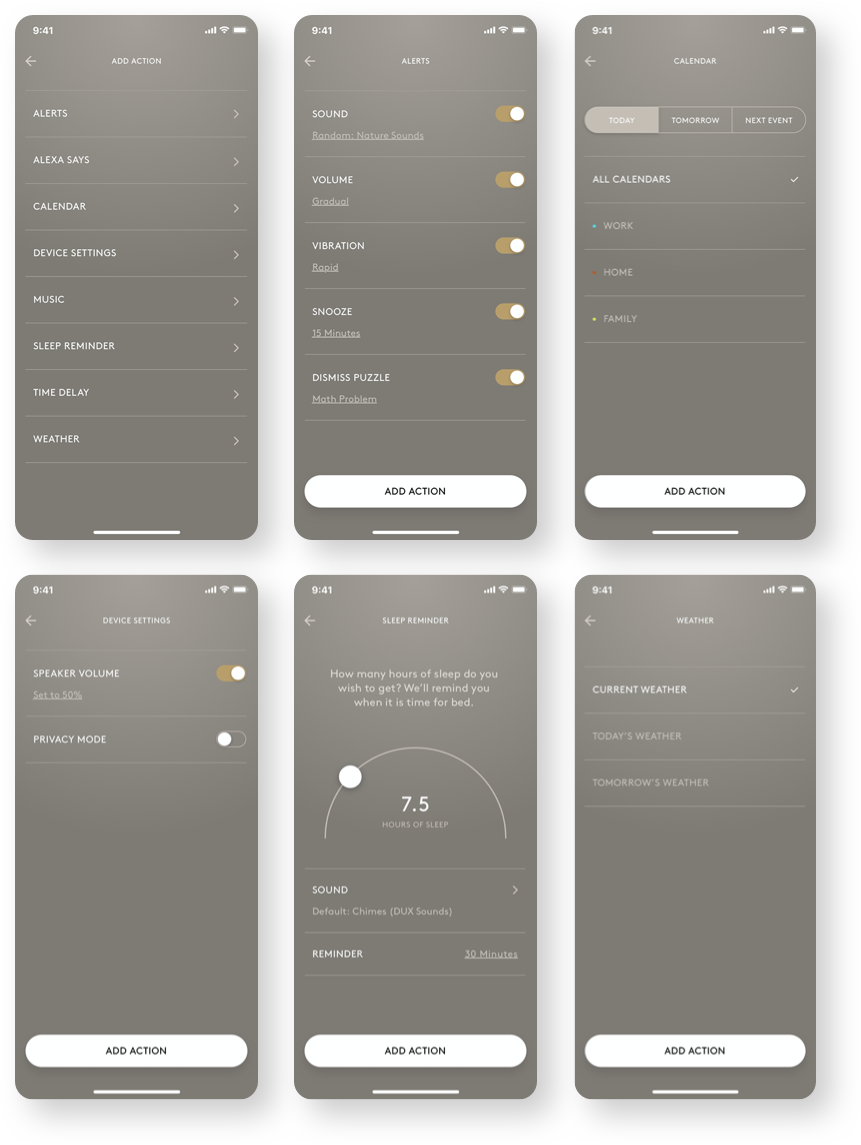
The amount of information for each scene could vary greatly as each scene is composed of one or more actions and each action has multiple settings. To prevent flooding the user with all of this content, I organized the information and used progressive disclosure to prioritize what needed to be displayed at every point of the experience.
/ Night Mode
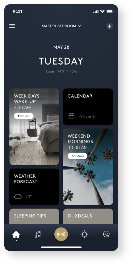
Easy on the eyes
Ideally, people will not be using the app before they go to sleep but we have to be prepared for when they do. With that in mind, I implemented a night mode that features a dark style to make it easy on the eyes and has the least amount of negative impact on the user's sleep quality.
/ Privacy Mode
Getting intimate without Bezos.
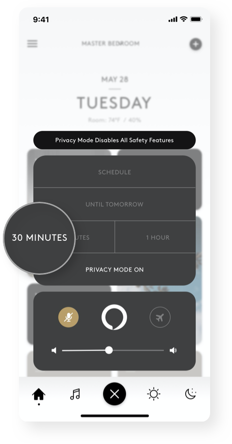
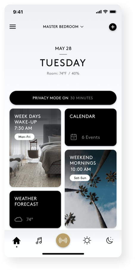
Did you get the pun? No? (Alexa, Jeff Bezos, kisses in Spanish) Okay, moving on...The bedroom can be a very intimate and private place and our research showed that this was a big area of concern for the product so it was crucial to make a privacy mode that was fast and easy to enable.
People go about intimacy very differently, for some it's spontaneous, and for others, it's scheduled (every Thursday night from 9:00 to 9:05). Instead of privacy mode just being enabled/disabled we provided additional options to meet the demands of each occasion.
/ travel Mode
Traveling is not always synonymous with vacationing
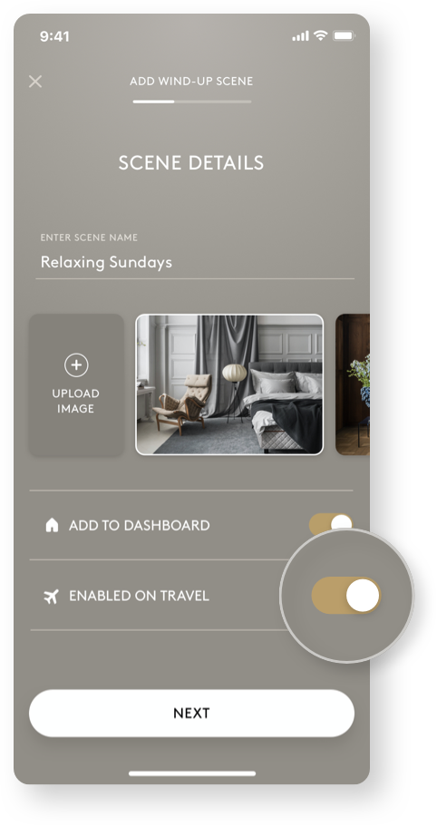
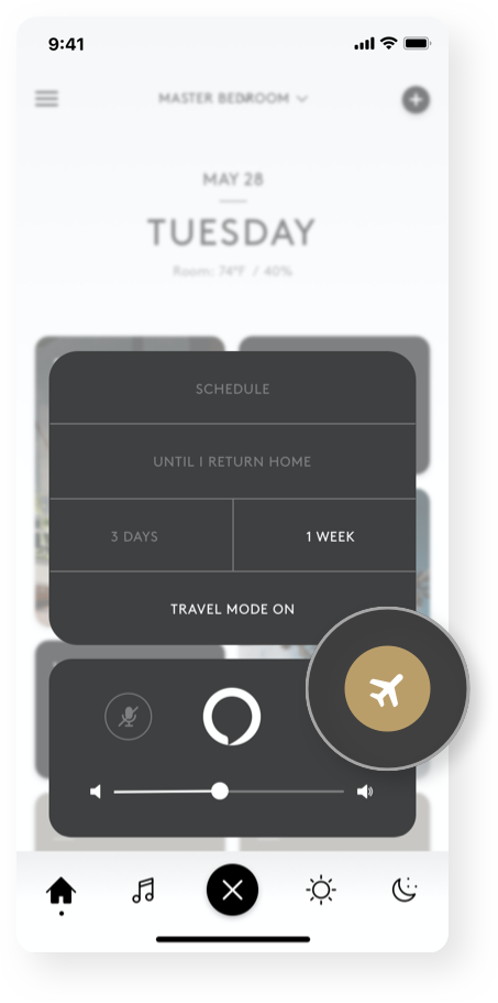
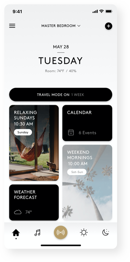
Whether you're traveling for work or pleasure, your sleeping habits during that time may be impacted in a way that are detrimental to your sleep health. Enter travel mode, a feature that allows you to keep up with your routines and get quality sleep no matter where you are in the world.
When travel mode is on, any scene with travel mode enabled will be executed through your phone's speaker instead of the bed's speaker module. All of the other scenes will be temporarily disabled until travel mode is turned off.
/ adding a scene
Sleeping better, made easy
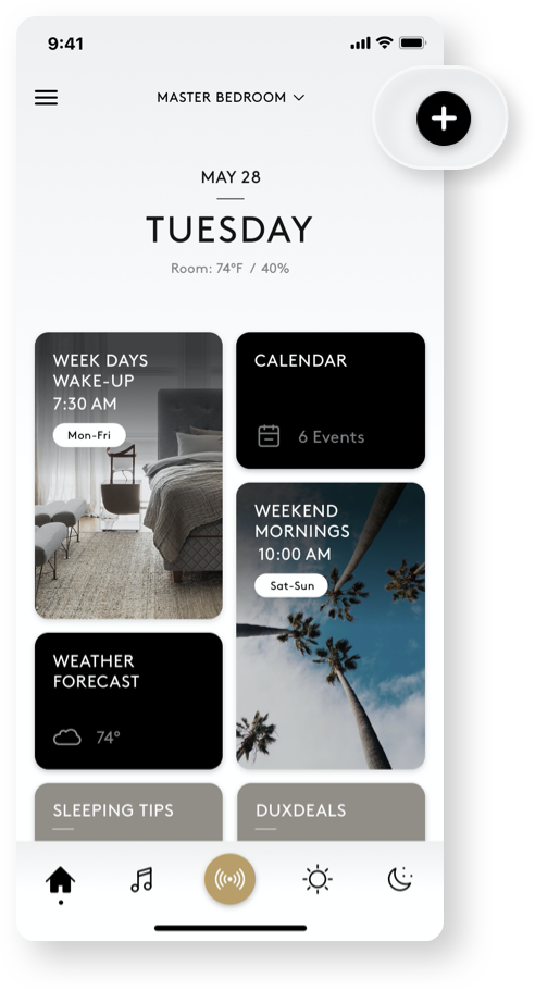
Adding a custom scene is one of the most important sections of the app so I needed to account for different needs while keeping it fast and easy to set up. In order to not overwhelm the user, I broke up the process into different screens and took a graphical approach to settings configuration. In addition to custom scenes, I worked with Duxiana to feature pre-built scenes made by them based on their sleep knowledge and research.
/ action settings
Setting the settings of a setting within settings
Offering multiple actions to meet user's needs came with its own challenge. Since each action contains multiple settings that need to be set, keeping the same sequential, left to right, flow heavily dragged out the experience. To account for this issue, I employed a flexible slide-up modal that could house a variety of different settings while keeping it close to thumb-reach.
/ Essentials
Covering all the bases
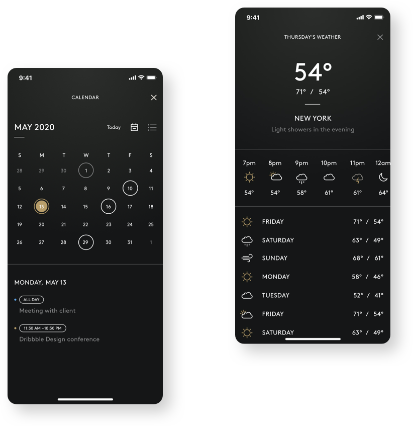
In addition to social media, the two things that a majority of people reported checking before going to sleep were their schedules and the weather. Although you could ask Alexa for that information, we included them as individual screens for users who preferred to check this information visually within the app.
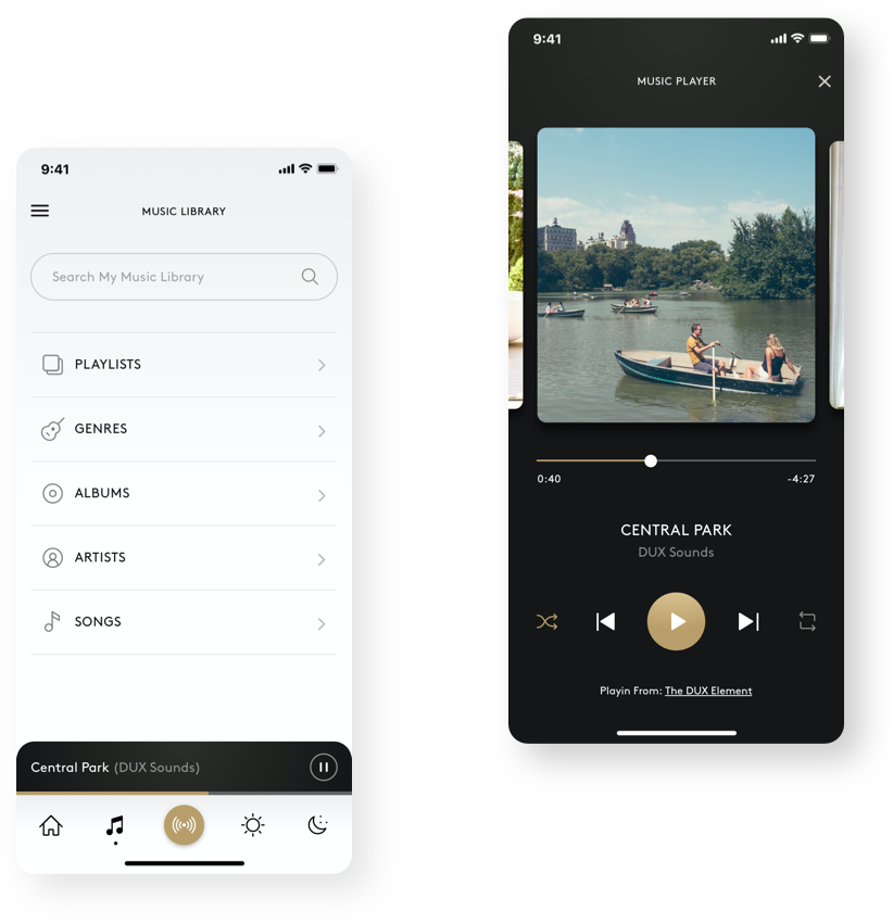
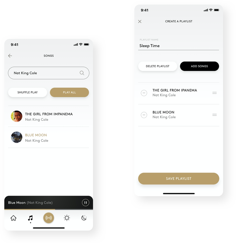
Because of time constraints, the initial version of the app was not going to launch with integration of music streaming services such as Spotify or Apple Music. It would instead offer an extensive library of Duxiana sounds catered to the sleeping and waking experience.
/ retrospective
My vision for what could be next
Dux Scenes Taking Center Stage
One of the things I would do differently is to give the scenes created by Duxiana more prominence. I would have liked to validate my assumption that users are more prone to adopt scenes already created by sleep experts than to create their own. To push this one step further, integrating a questionnaire during onboarding to understand the user's current sleeping habits and provide Dux scenes that are personalized and valuable to the user based on their answers.
Coming to an App Store Near You
The Dux Element is set to launch later this year. It has been featured in numerous places, from CNET to Amazon's booth at the Consumer Electronics Show. I will be tuned to see how well this solution solves the problem by measuring success through customer feedback and user reviews.
WEBSITE & VIDEO
Expanding Airbnb's Platform & Experience
© 2020 JUAN F OCAMPO