WEBSITE
Aligning Work Caliber with Digital Presence
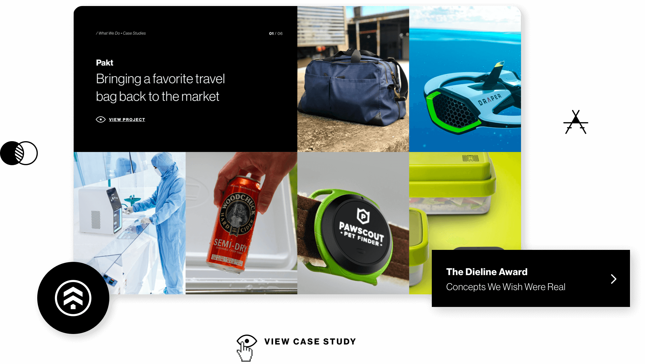
After rapid growth in terms of size and quality, industrial and digital design agency, Sprout Studios, was dealing with an outdated website that did not accurately portray the current quality of their work. Being a team member at Sprout, I jumped at the opportunity to rethink the approach of our digital presence, both in terms of content and aesthetics.
Role
Discovery, User Interviews, Information Architecture, Prototyping, User Interface
Client
Sprout Studios
Team
Project Manager
Web Developer
/ The problem
A studio's website that no longer related to the studio
A studio's website that no longer related to the studio
In the course of two years, Sprout went from 3 employees to over 20, bringing in quality talent resulting in outstanding work. Although the quality of work had drastically improved, the way we were presenting ourselves to potential clients was still using old design materials that no longer aligned with our work.

/ challenges
Dipping toes
There was a lot of hesitation from higher up to redesign the whole website due to time and resources. Initially, I was given the green light to only reskin the website but based on the research I gathered, we needed to go beyond that.
Existing projects
There were over four years of projects and blogs on the website that would need to be migrated effortlessly with minimal dev time. This posed a challenge since the design would need to follow to a certain extent the backend configuration that was already in place.
/ research
/ research
Noting what is working and what is not
The first step was to analyze our current website, digging into how the content was structured as well as the purpose of the content that was being presented. I also wanted to find out how the different pages were performing and what takeaways I could use to better refine the website's architecture. Thankfully, we had Google Analytics setup which allowed me to dive deeper into specific metrics that I could use to not only inform my decisions but also as a way to measure the success and failure of the redesign.
~55%
Bounce
~2
sessions
1:54
avg. duration
Next, it was time to talk to the target audience: clients. I put together a questionnaire for our current and past clients to find out what had drawn them to Sprout and what they look for when shopping around for an agency. The feedback that I received from the questionnaire and interviews would prove crucial in getting management on board.
"I make a decision based on the work, the capabilities, and the type of clients..."
Main Factors
- Projects/Case Studies
- Capabilities
- Range of clientele
Additional Factors
- Team size
- Location
- Process
/ goals
Increase website engagement and client inquiry
Making it easier to contact
The previous website did not have a contact page, it was instead tucked-in to the footer. One of the main goals was to make it easier for clients to reach out and explain their needs.
Consistent brand identity
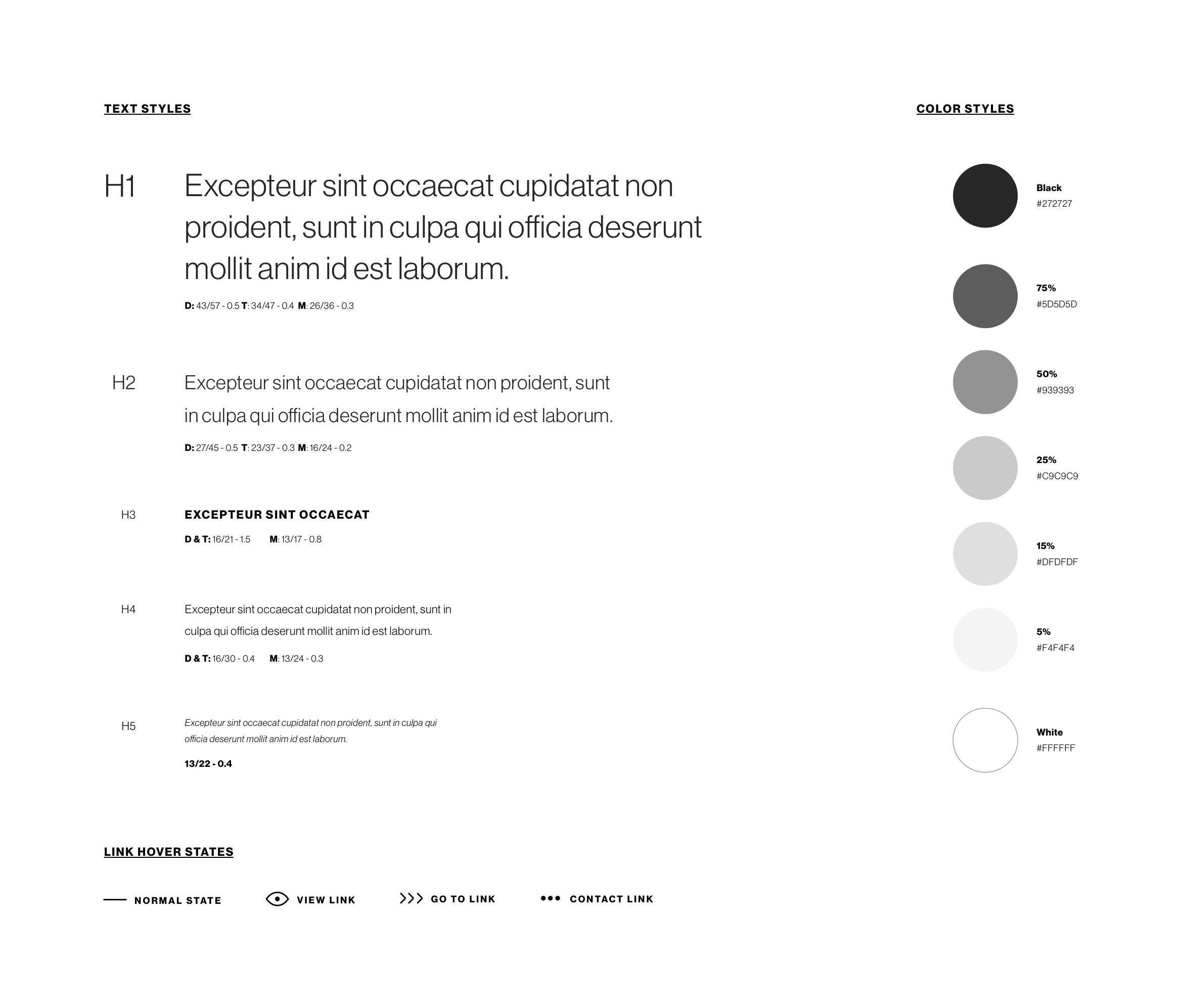
We were already in the process of updating a lot of our collateral material with a new brand identity so I set out to establish a strong, consistent aesthetic, that expanded and added on to the styling that had been developed thus far.
/ structure
/ structure
An informed architecture
An informed architecture
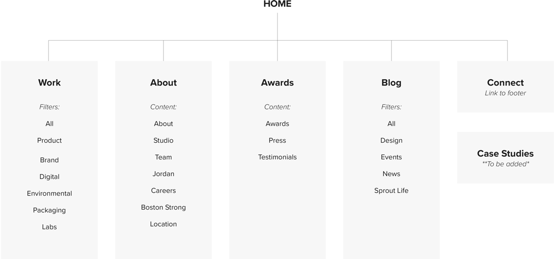
After gathering all of the material from the research, I mapped out the existing site architecture and then worked on validating the content based on research findings. I met with upper management to get their input on their perceived value of the existing site's content and structure to better understand their intentions from a business perspective.
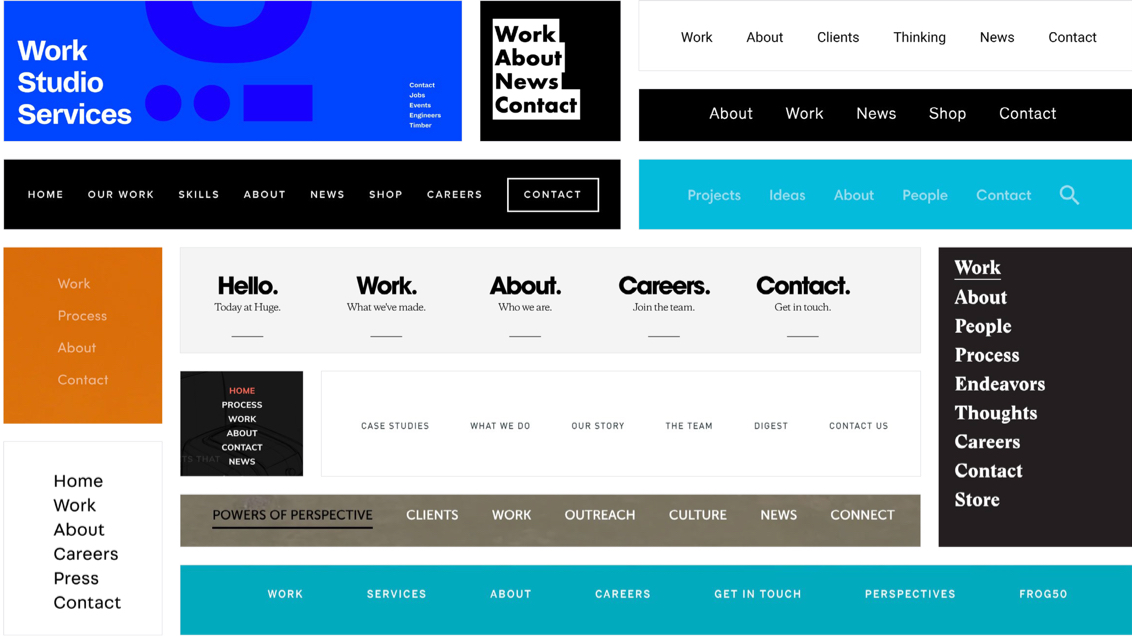
The competitive market research focused on analyzing small to medium-sized agencies as well as large international firms to note their approach on what tends to be a pretty standard structure. One of the main findings was a trend amongst several agencies of including content to highlight their process/thinking and differentiate themselves from the competition.
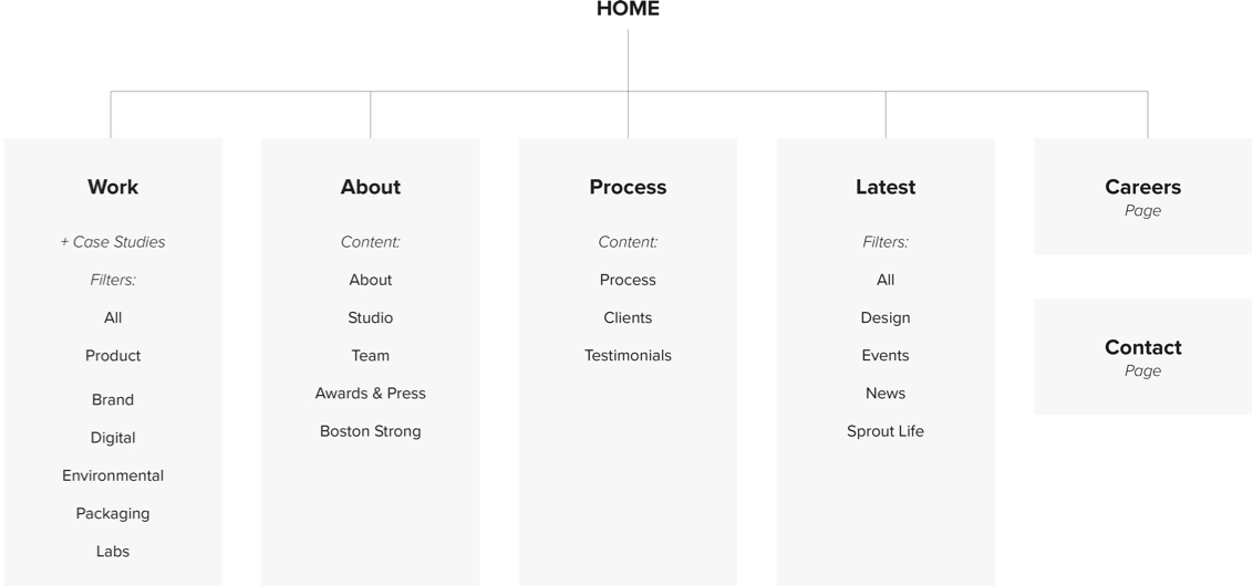
By synthesizing all of the research and holding a card sorting exercise with the whole team, I was able to define the new architecture for the site making key changes to higher-level pages and content distribution.
/ ideating
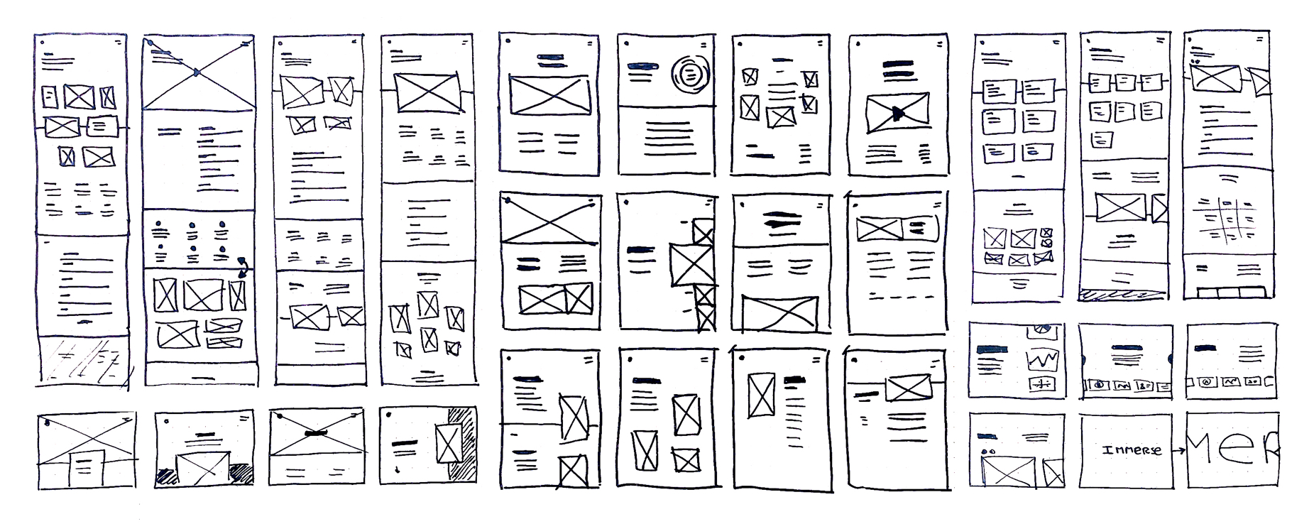
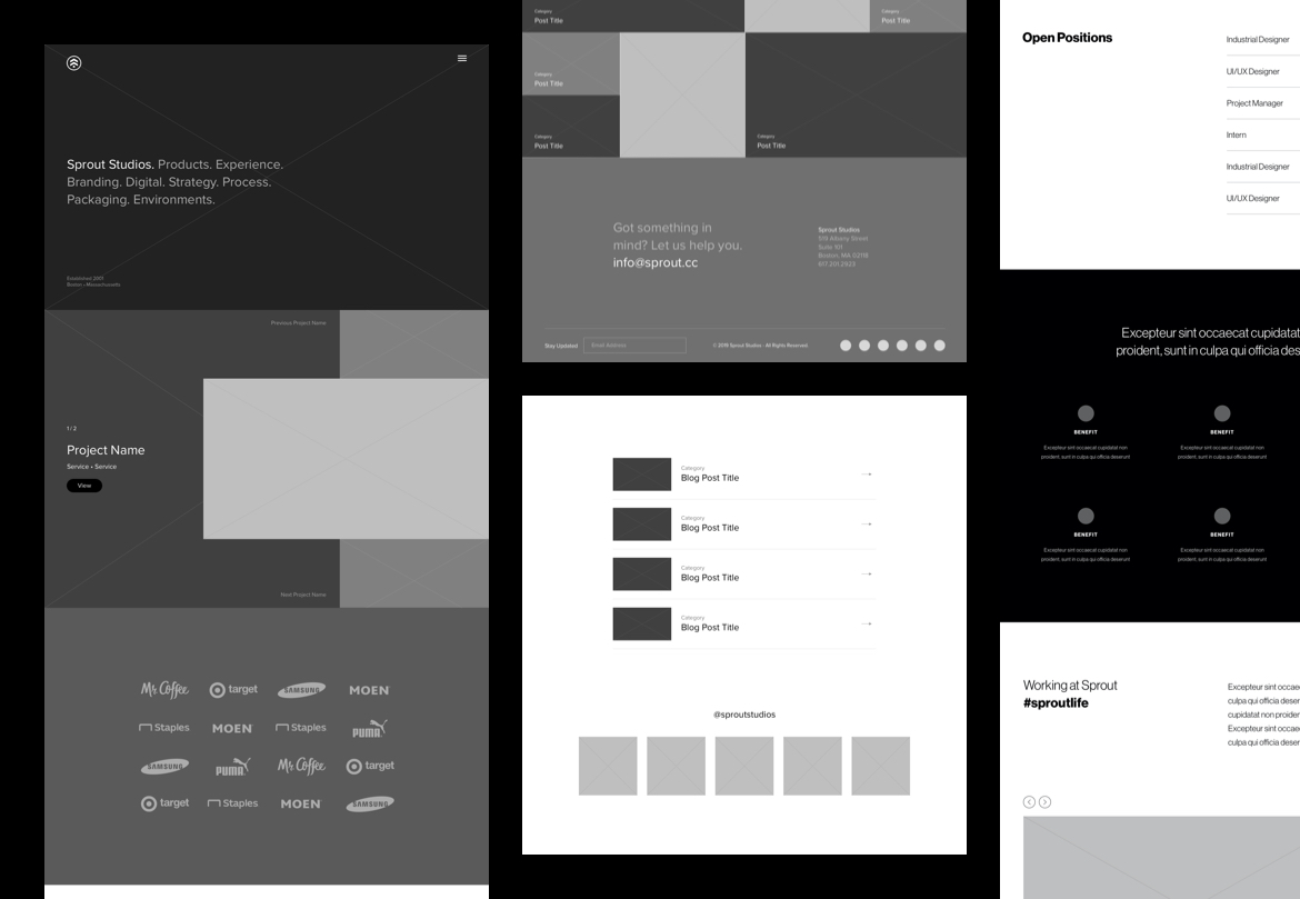
From sketches to wires
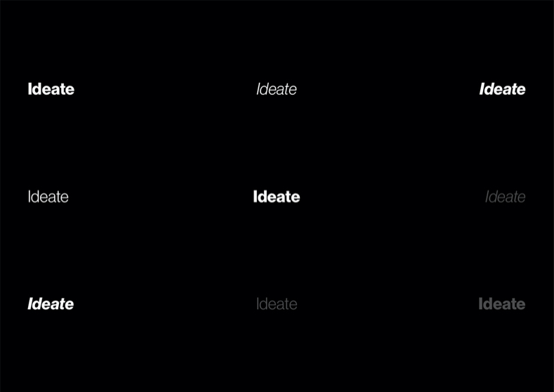
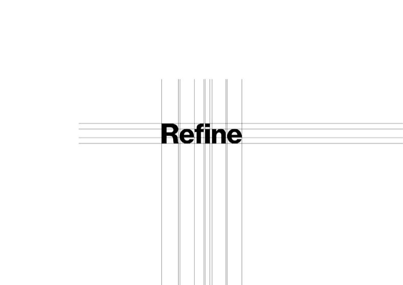
Ideating centered around unobtrusive layouts and interactions that would champion the work and not distract from them. Creating high fidelity wireframes was instrumental in getting specific feedback from the team by helping them visualize the different concepts.
/ prototypes
/ Prototypes
Testing out ideas
Testing out ideas
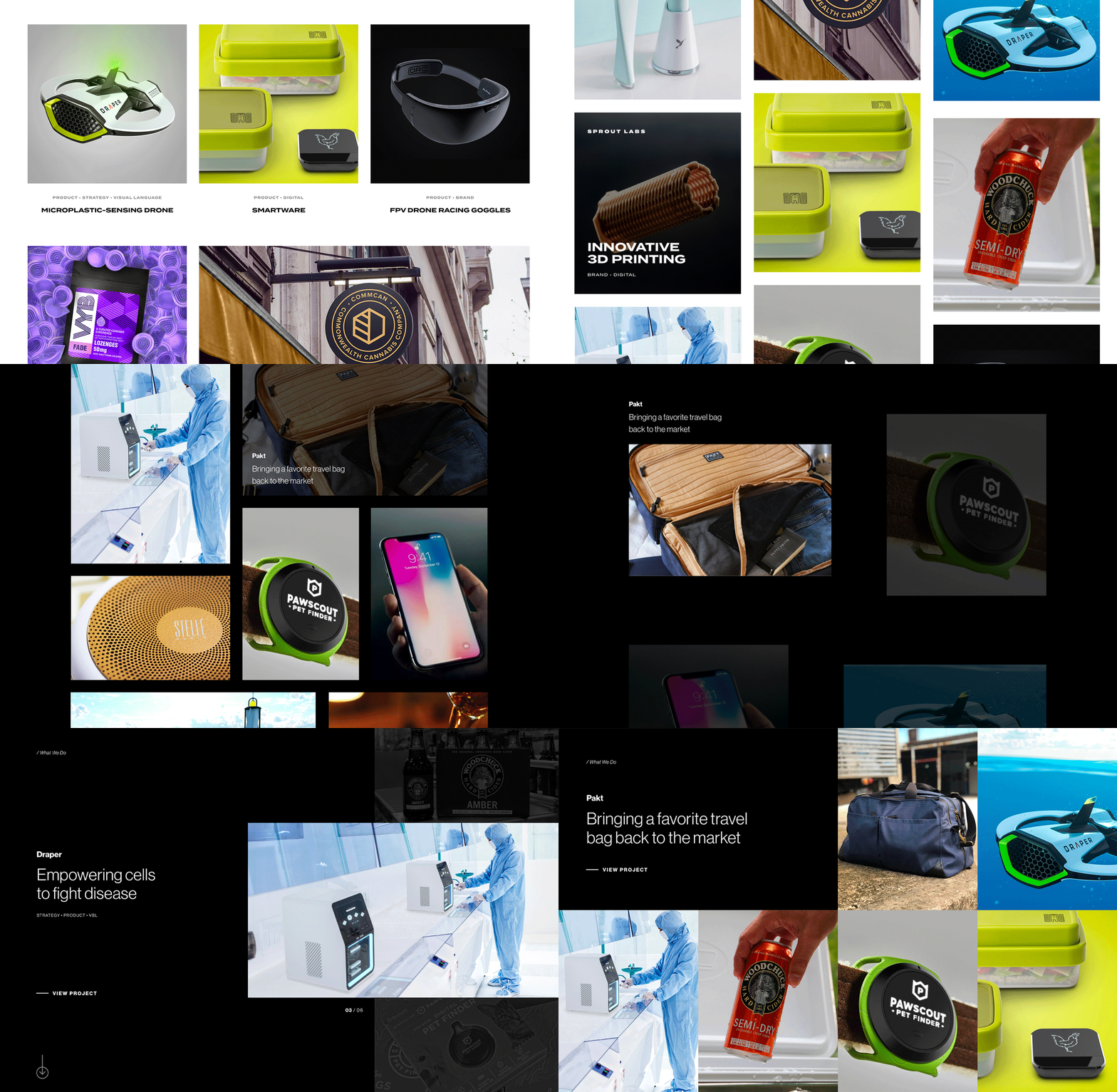
The work section on the homepage would be a visitor's first impression and needed to attract attention to encourage user interaction. I prototyped several ideas that approached answering the following questions in different ways: How many projects should we highlight? Should they all be seen at once or highlight each project individually? How to differentiate between case studies and projects? Can we use animation to spark visual interest?
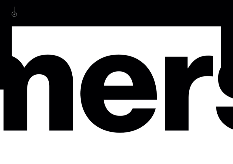
The process page was a completely new page to be added to the site and I wanted to take the opportunity to make it an engaging experience that would be memorable to a potential client and set us apart from our competition.

/ Design
A modular system
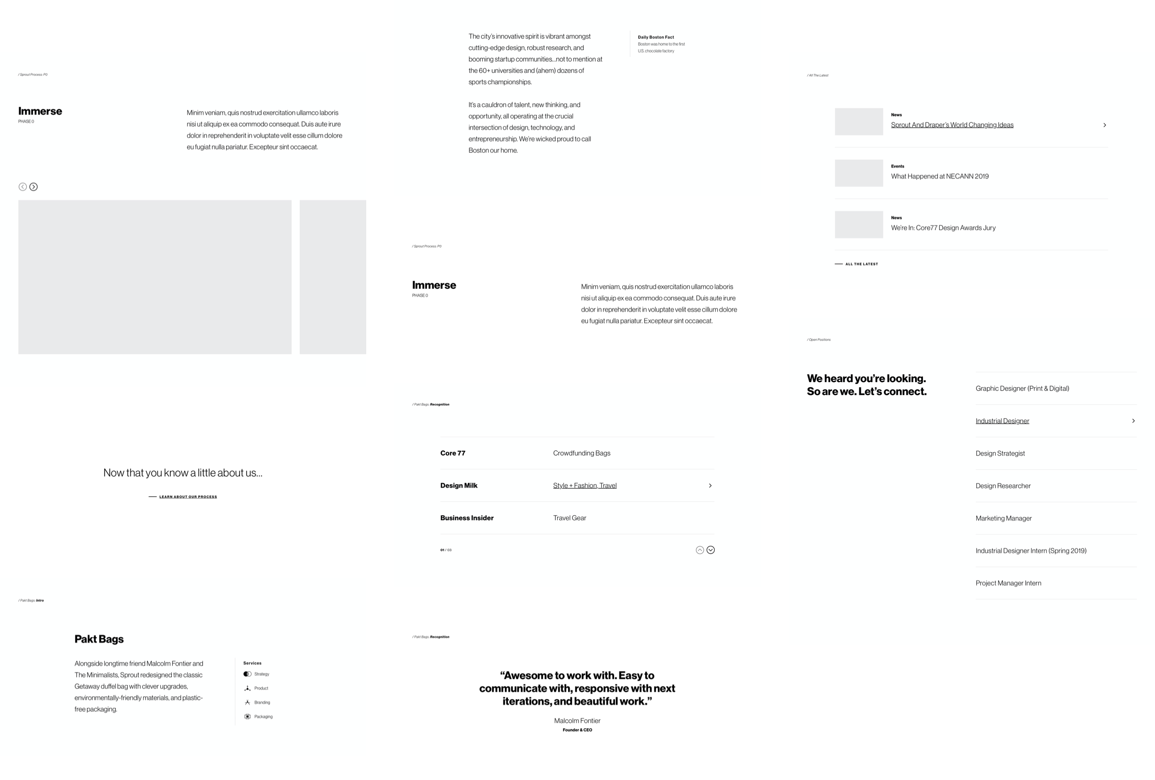
I closely collaborated with the developer to create a number of patterns/modules that could be used across different pages to minimize development time while making each page unique.
/ final product
Keeping tabs and buckets
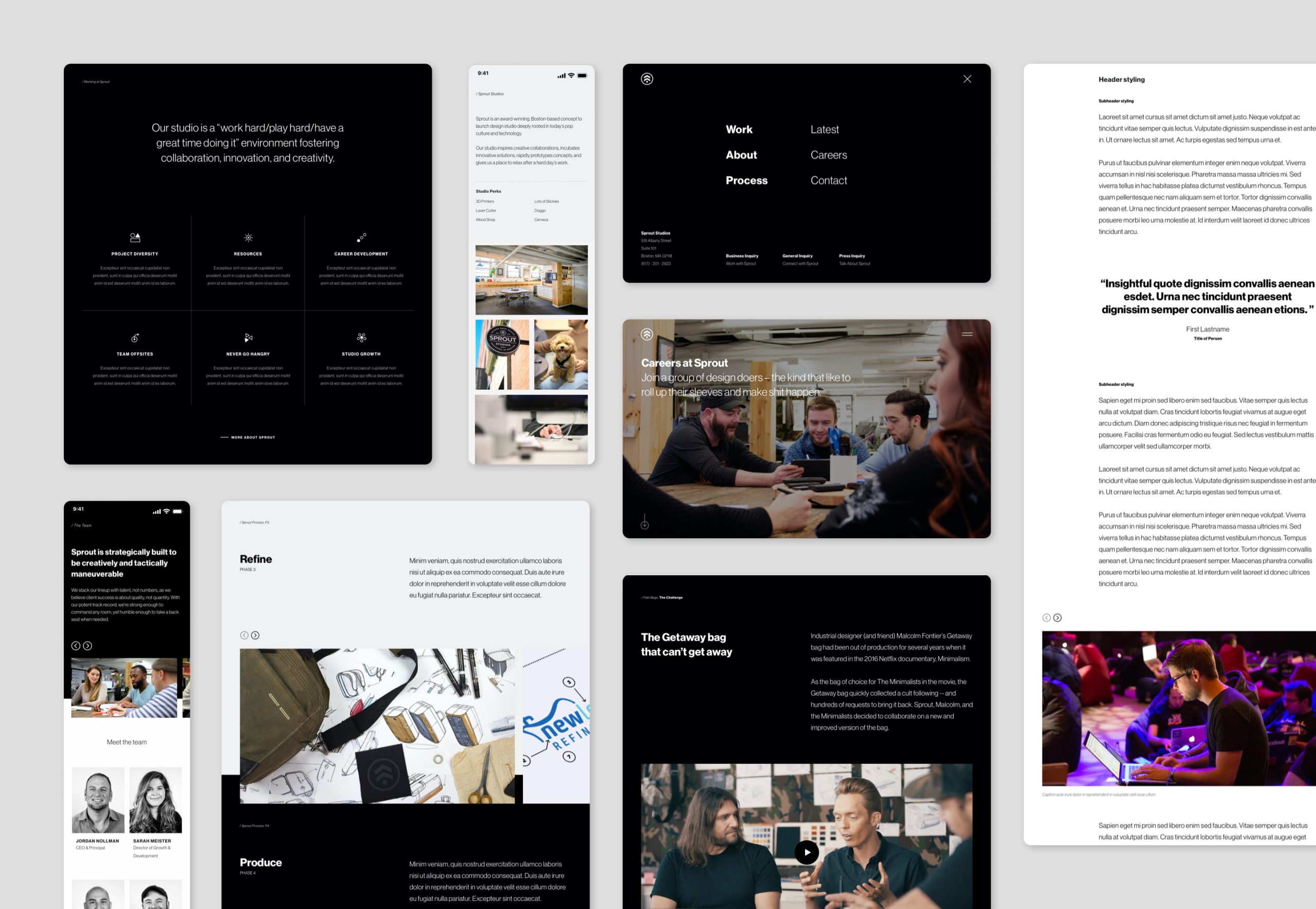
Similar to how a museum gives center stage to the artwork and it does not attract attention to itself, I wanted the design of the website to do the same. A minimalistic aesthetic was used intentionally to bring color and drive visual engagement through photographs, renders, and videos.
/ details
/ research
Making it Sprout
Given the minimal black and white aesthetic, I wanted to find ways to bring more personality to the site and make it unique to Sprout. I took the opportunity to do so through custom iconography and interactive components such as hover effects on the logo and text buttons.
/ rETROSPECTIVE
/ retrospective
A positive change
Metrics
From total visitors to page views and even to client inquiry, the new site has seen a positive improvement in nearly every metric. The redesign is just one key piece in the collective effort from the whole team to be more active in our respective communities and a byproduct of creating outstanding work that is being recognized across multiple publications.
-42%
Bounce rate
+59%
sessions
+72%
avg. duration
From the get-go
One of the things that I could have done differently was to get management on board for the full redesign from the get-go. The hesitation to approve the redesign resulted in time that was lost exploring skinning options. I could have done research much earlier to present the business value of investing time and resources into the redesign.
DESKTOP APP
Leveraging an API to Optimize Time Tracking
© 2020 JUAN F OCAMPO