WEB APP
Unifying the Main Learning Experience
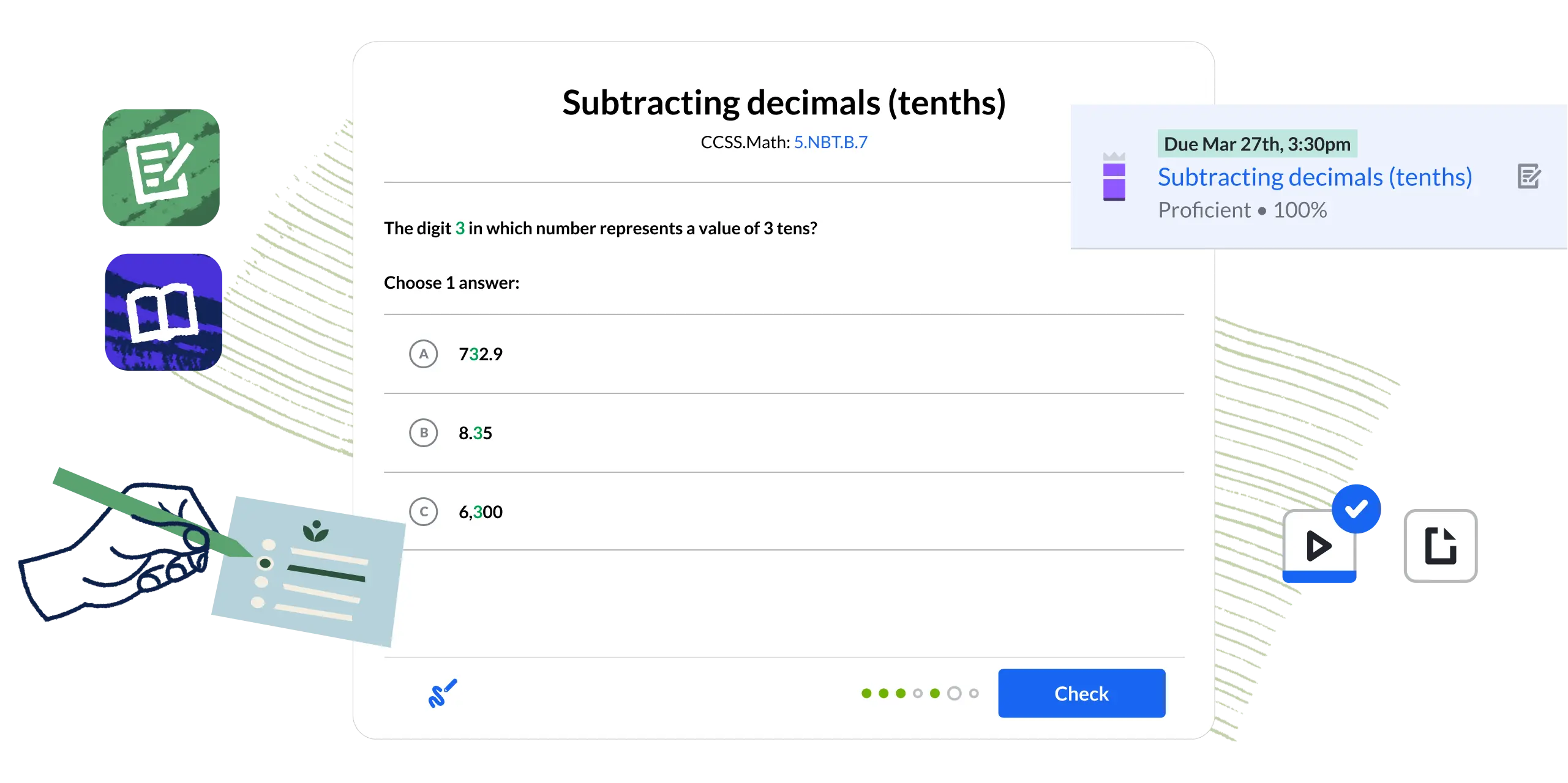
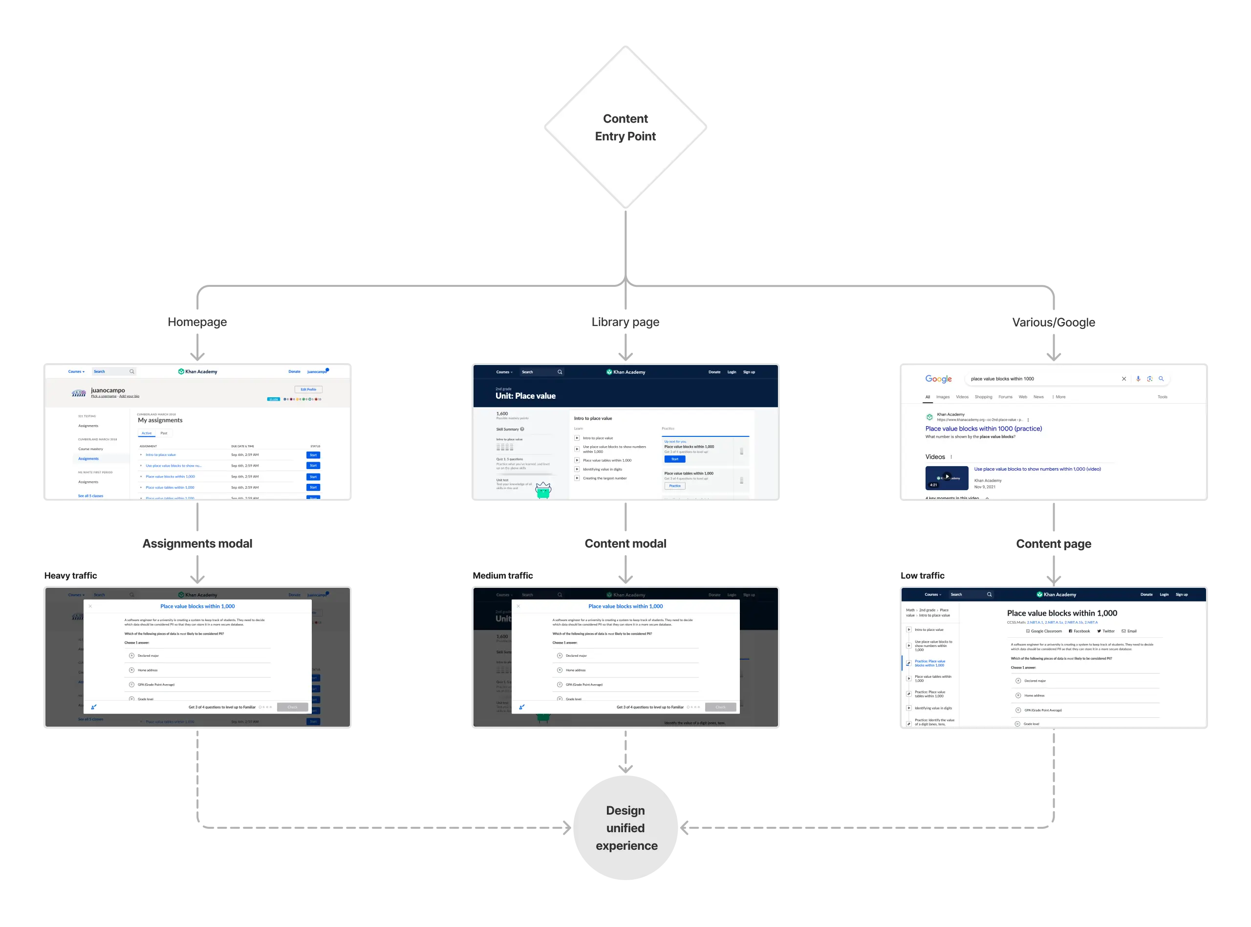
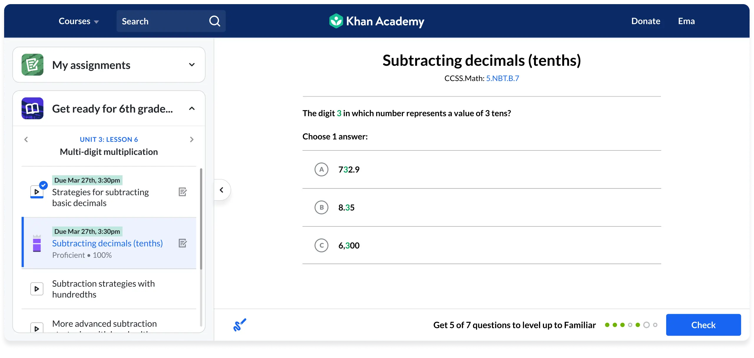
Learners on Khan Academy often encountered the same content through three different and inconsistent views, leading to confusion and disrupting their learning experience. This fragmentation meant that students in the same classroom were stumbling into unexpected views, making it difficult for teachers to guide their students and keep them focused on learning. Maintaining these separate views was costly and inefficient for engineering, hindering our ability to innovate. To solve this problem, I led a cross-functional effort to unify the views into a single, cohesive learning experience, streamlining access for over 140 million learners and simplifying future product development.
Role
Design lead
Project length
12+ months
Team
Design, product management, engineering, data & effiacacy, user research
/ CONTEXT & SCOPE
Understanding the full picture and impact
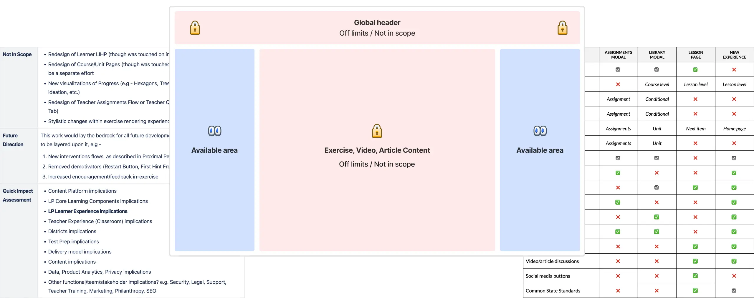
Unifying the views required a deep understanding of the diverse contexts and needs of students, teachers, and the organization. Recognizing that this change would influence every team, we carefully coordinated across all departments to ensure alignment and a smooth transition.
/ IDEATING
Finding harmony between mastery and directed learning
Mapping out the current flows of an Airbnb host
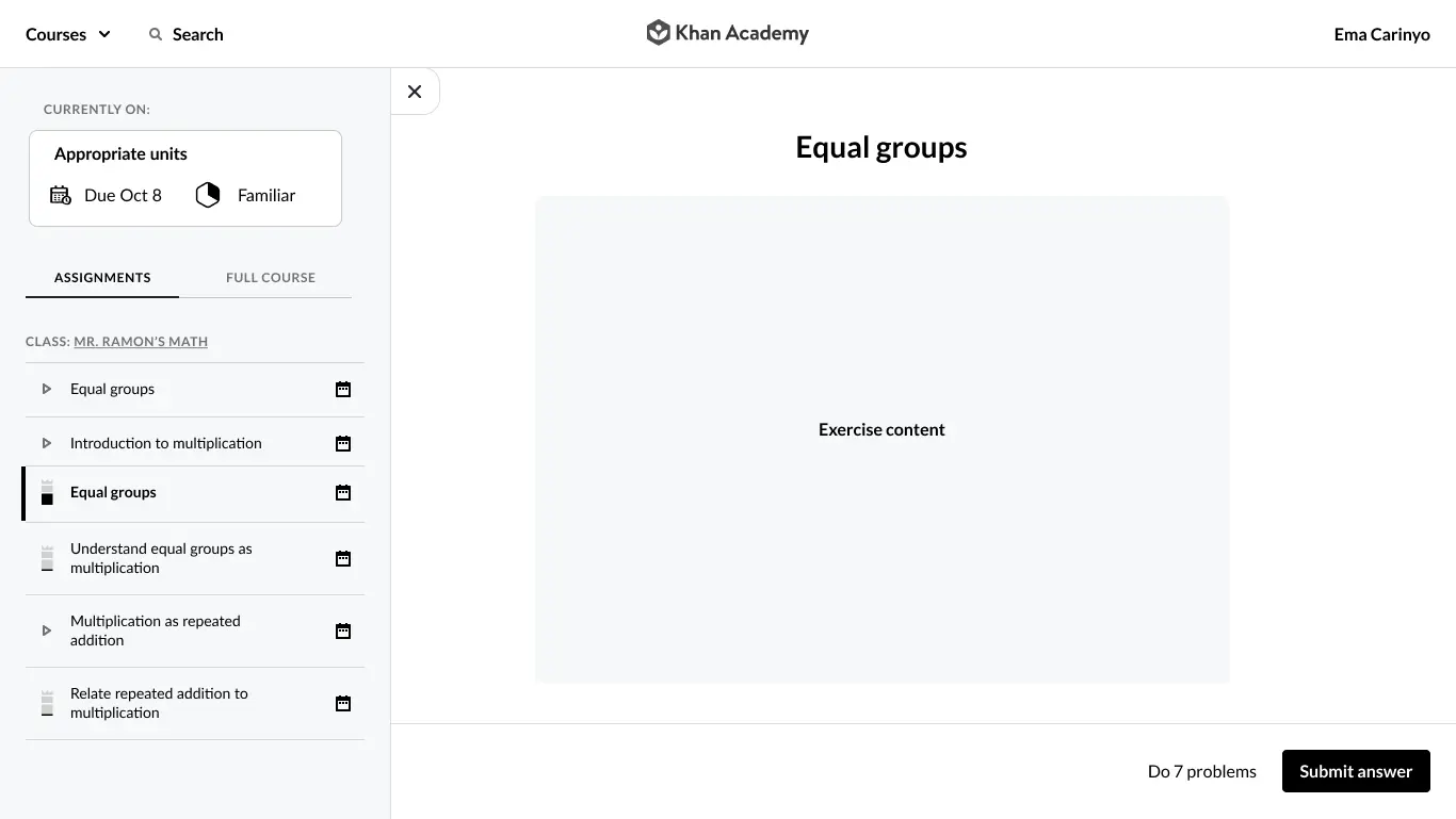
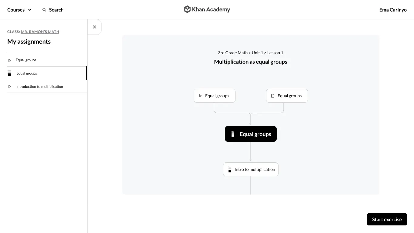
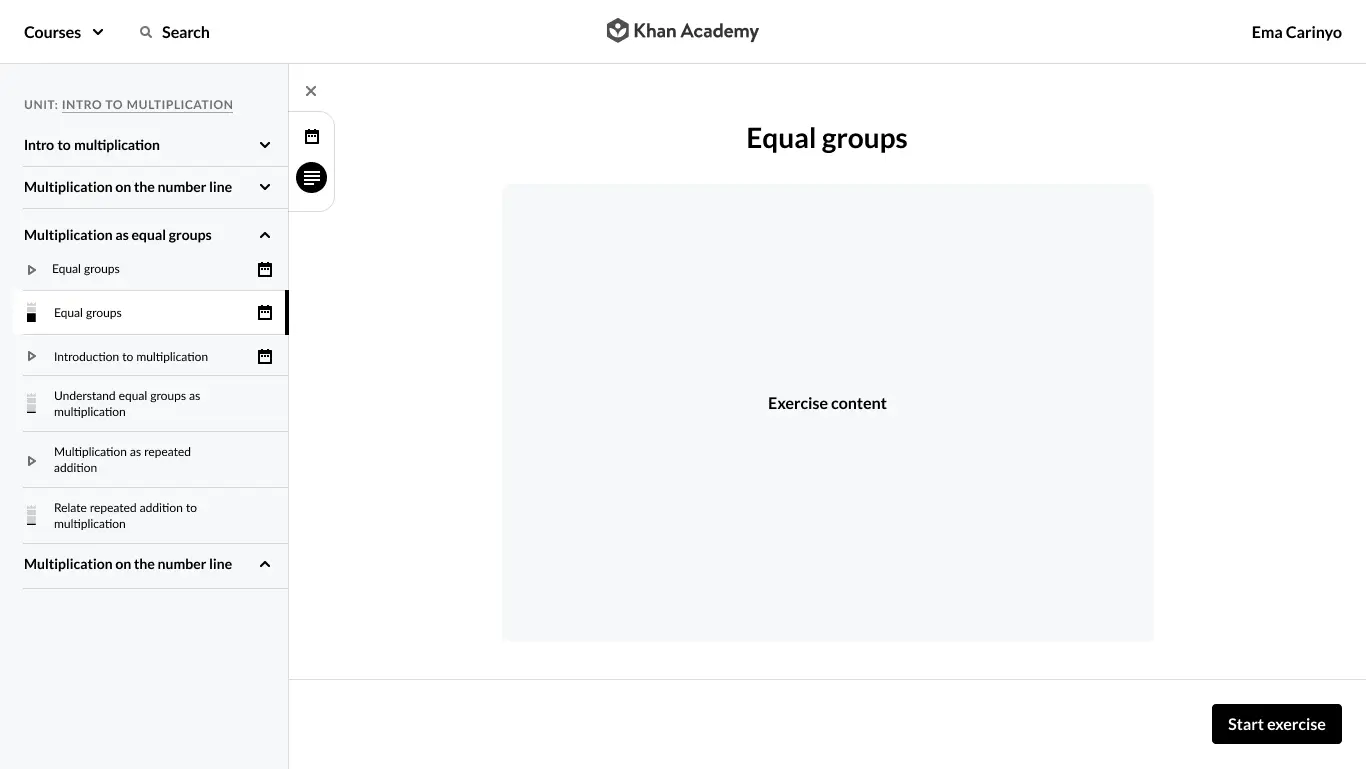
During ideation, balancing our commitment to mastery learning and student autonomy with teachers' needs for directed assignments was a critical challenge. I facilitated collaborative workshops with educators, internal stakeholders, and students to craft an experience that honors both values, supporting student autonomy while respecting educators' guidance.
/ VISUAL DESIGN
/ VISUAL DESIGN
Iterating toward a minimal, student-centered design
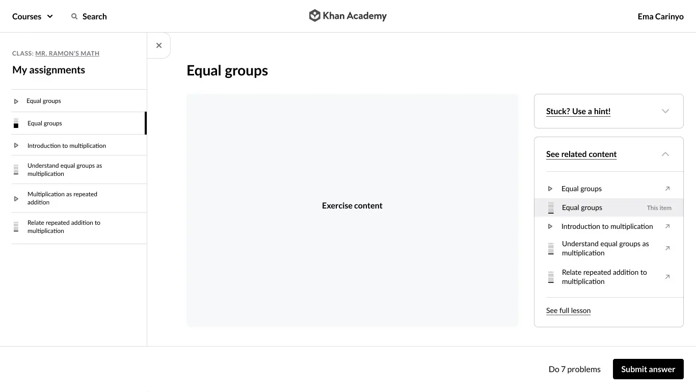
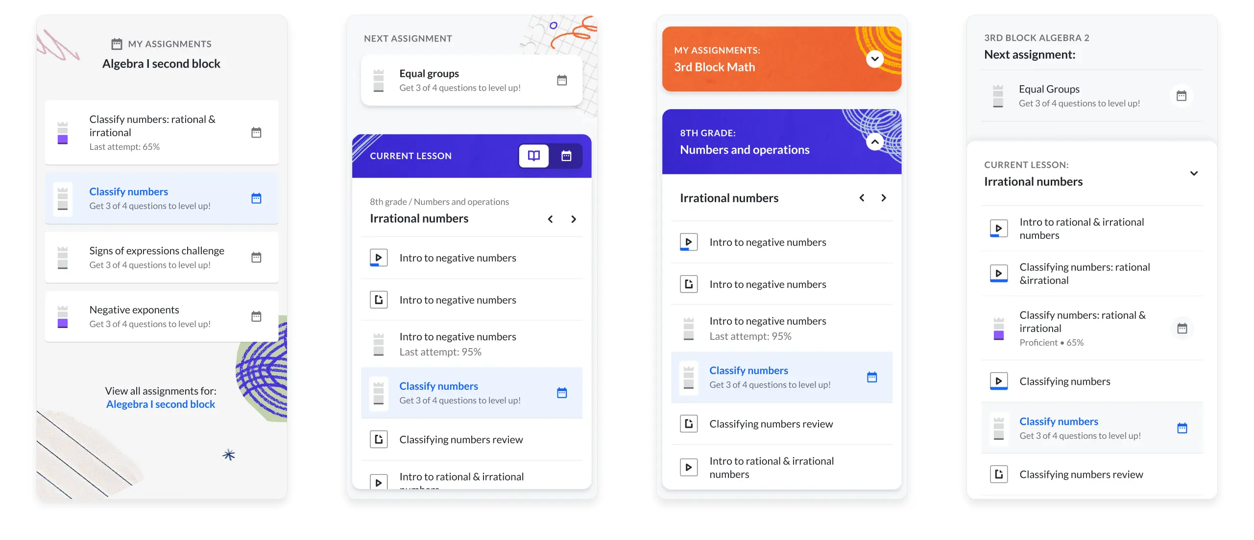
Transitioning from wireframes to prototypes, I leveraged our design system to create a cohesive experience and conducted user testing with students and teachers for refinement. Initially, adding color to the sidebar aimed to enhance visual interest, but feedback revealed it distracted from content. Adapting quickly, we shifted to a minimal design that enhances clarity and makes key information easily digestible, improving overall engagement.
/ AHOY
A foundation for future product developements
We measured success by ensuring no decrease in total learning time—the time students spend actively engaging with exercises, videos, or articles—and achieved this post-launch. The unification enhanced the platform's foundation for future development without disrupting learners' progress, sparking new ideas across the organization.
WEB APP